By Siddharth Borderwala
Published
18 min read
Brand guidelines examples: 12 real brand books and what to copy from each
Twelve brand guidelines you can open today, from Mastercard’s logo rules to NASA’s 1976 standards manual, with the exact rule worth copying from each, which ones an AI agent can read, and what it took to correct an agent’s version of Starbucks.
TL;DR
The best brand guidelines give exact values, show the wrong version next to the right one, say which mark, colour or font does which job, and cover the places the brand actually appears. Copy those habits rather than another brand’s look. If agents will use your guide, check that they can read it, and check what they actually receive from it.
The guidelines worth studying answer the question someone has just before they break a rule: which logo goes on this dark photo, which green is the button, whether a partner can put the name in their product. These twelve do. They’re grouped below by the habit worth copying, each with the rule itself, and three classic standards manuals come at the end.
We opened every guide on November 15, 2026, and the six behind the rule crops again on November 16. The nine modern guides link to their live originals. The three historic manuals link to the closest original you can inspect: NASA’s own scan, the original New York subway binder in a design archive, and the British Rail manual’s sheets on a collector’s site. Nine of the brands also have a page in Rainbrand’s brand guidelines library, which collects the logos, colours, fonts and voice of 200 brands.
The twelve at a glance
| Guide | What to copy | In the library |
|---|---|---|
| Mastercard Brand Center, web portal | Every ban names what to use instead | Mastercard |
| Spotify Design & Branding Guidelines, developer docs | Numbers for every rule a partner could argue with | Spotify |
| NASA brand guidelines, updated February 27, 2026 | One job for each of three marks | NASA |
| GitHub Brand Toolkit, web portal | Retired logos listed with their dates | GitHub |
| Figma brand guidelines, web page and PDF | Correct and incorrect sentences side by side | Figma |
| Mailchimp brand assets, one web page | The essentials on one page, in the brand’s own voice | Mailchimp |
| Starbucks Creative Expression, web guide dated 2020 | Named colours and typefaces, each with a job | Starbucks |
| IBM Design Language, web guide | Numbered colour steps with rules written in those numbers | IBM |
| Snapchat Brand Guidelines, 16-page PDF, 2025 | A fallback for each brand font | Snapchat |
| NASA Graphics Standards Manual, 1976, NASA’s scan | Incorrect uses drawn out, and rules for vehicles, signs, forms | |
| NYCTA Graphics Standards Manual, 1970, the original binder | Signs specified down to how they’re built | |
| British Rail Corporate Identity Manual, 1965, the manual’s sheets | One identity across trains, stations and print |
Logo rules people can follow
Many public guides are written for the outsiders who place the logo: merchants at checkout, developers in their apps, journalists in their articles. The best logo pages answer those people without a phone call.
Mastercard: name what to use instead
Mastercard’s Brand Center is written for the merchants, banks and partners who show its marks. Its requirements page has the clearest logo rules we read. The Mastercard Symbol, the two circles without the name, “must be used in full color” and “must never be used in grayscale or other colors”. The page doesn’t stop at the ban: when full colour isn’t available, use the grayscale or solid Mastercard Brand Mark instead, and it shows both.
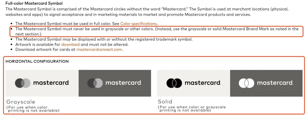
The ban and its replacement, from Mastercard’s branding requirements (Configurations, expanded). Outlines added. Captured November 16, 2026.
The other rules are just as concrete. Clear space is at least a quarter of the width of one circle. In text, the name takes an uppercase M and a lowercase c, with no space, in the same font as the words around it. The page opens with a dated list of changes, three of them marked December 2023, so a returning reader sees what’s new first.
For every “never” in your own guide, say what to use instead, so someone with a one-colour print job has an answer.
Spotify: give partners numbers
Spotify’s design guidelines sit in its developer documentation because they’re written for apps that play Spotify content. Every rule a partner could argue about has a number. The logo is never smaller than 70 px on screen or 20 mm in print, and the icon on its own never smaller than 21 px or 6 mm. The clear space equals half the icon’s height. The green logo goes only on black or white; on any other background, use the black or the white version. Partner integrations always use the full logo, and “the wordmark should never exist without the icon”.
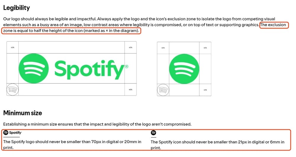
Clear space and minimum sizes as numbers, from Spotify’s Design & Branding Guidelines. The diagram’s corner labels read 40%, while the text sets the clear space at half the icon’s height. Outlines added. Captured November 16, 2026.
It covers Spotify’s content as well as its logo. Album art stays in its original form, takes a 4 px corner radius on small and medium devices and 8 px on large ones, and never carries text or playback controls on top. And it rules out co-branding in one line: “Don’t use the Spotify brand together with any other brand or in any co-branded communications.”
Wherever two people could disagree in your own guide, about how small, how much space or which background, a number settles it. Then check that your diagrams say the same thing as your text.
One job for each mark
NASA: three marks, three jobs
NASA has three official marks, and its brand guidelines, updated February 27, 2026, give each a job:
- The insignia, the blue “meatball”, “must be included on all agency publications, displays, visual communications and markings”.
- The logotype, the red “worm” designed in 1975 and NASA’s official logo from 1976 to 1992, is back as a supplemental graphic. It “should never appear without the Insignia in appropriate proximity except on commercial merchandise”, comes in NASA Red, white or black, and every use goes to NASA’s communications leadership for review.
- The seal is reserved for the Administrator and is never used together with the insignia.
Outside NASA, none of the three can be used without explicit permission. If your brand has more than one mark (a symbol, a wordmark, a seal, a sub-brand), say which one each situation calls for, or people will pick the one they like.
GitHub: list the marks you’ve retired
GitHub’s Brand Toolkit reaches well past the logo, from Copilot and co-branding to presentations, swag, diagrams and motion. Its logo page sorts the marks by job. The Invertocat on its own is for “GitHub-owned environments or where the brand is already clearly established”, the lockup with the wordmark is for most other places, product lockups such as GitHub Copilot are for products that stand on their own, and events such as Universe get their own marks.
The section to copy is the one on deprecated logos. Each retired Invertocat and logotype is shown with the years it was in use, and the old Copilot lockup carries a no sign: “Beginning in 2025, GitHub Copilot no longer has a standalone logo that heros the Copilot icon.”
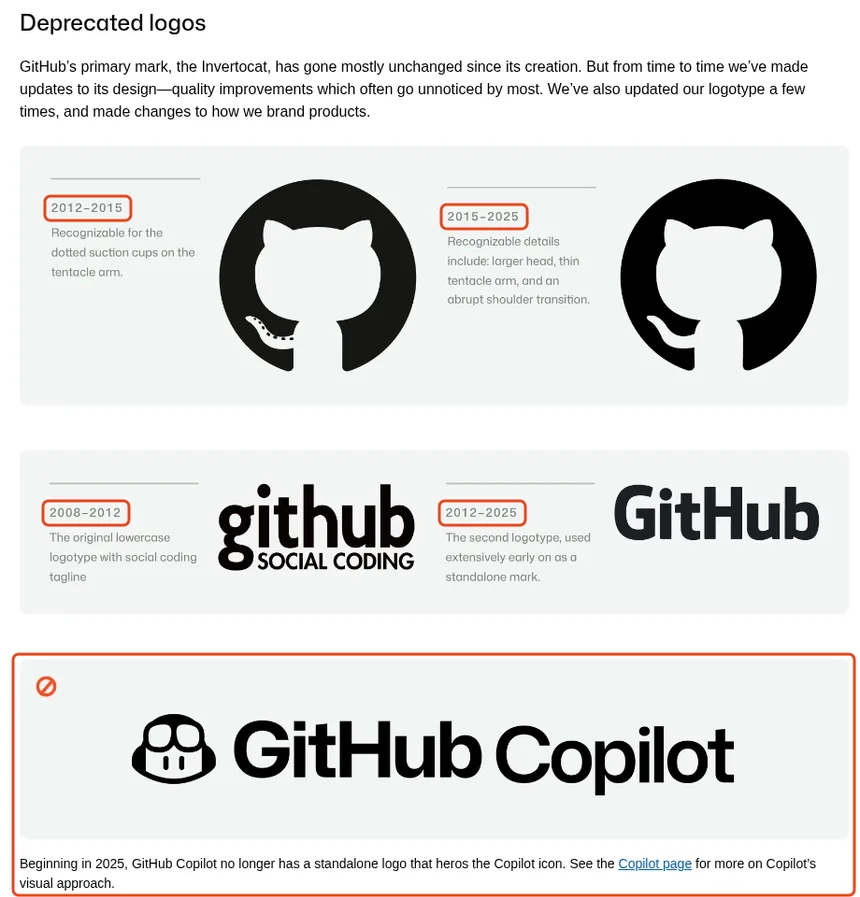
Retired marks with the years they were used, from GitHub’s Brand Toolkit. Outlines added. Captured November 16, 2026.
Old logos live on in slide decks and image search results. A guide that lists them, with dates, saves someone, or an agent, from bringing one back.
Names and permissions
Figma: show the right and wrong sentence
Figma’s brand guidelines page is mostly about the name, because it’s written for the community that writes and talks about Figma. Use is allowed “so long as you are truthful, fair, and not misleading”. Figma is used as an adjective (“the Figma platform”), never as a noun or verb, and not in the possessive unless the sentence is about Figma the company. Neither Figma nor part of it, such as “Fig”, goes into a company, product or domain name.
Then it shows the rule as a pair of sentences, which is easier to follow than the word “adjective”:
| Correct | Incorrect |
|---|---|
| Clara’s tutorials for FigJam | Clara’s FigJam tutorials |
The visual rules are in a separate 11-page Brand Book PDF, and they’re as specific as the naming rules: the clear space around the wordmark or icon should match its height, and marks sit on a layout’s outer edge.
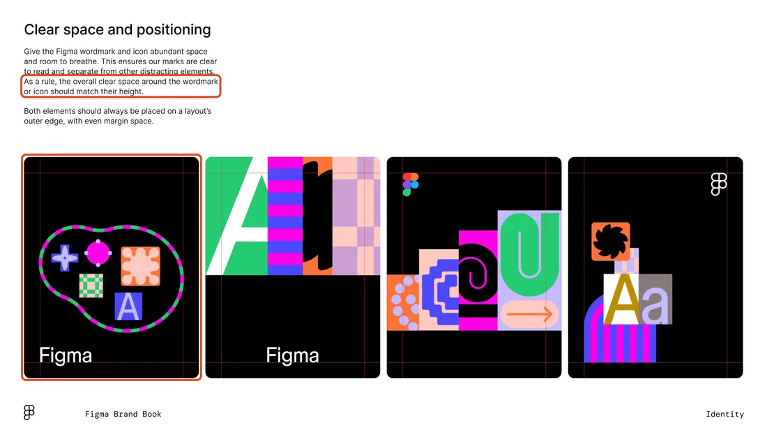
Page 4 of Figma’s Brand Book PDF. Outlines added. Downloaded November 16, 2026.
Mailchimp: one page in the brand’s voice
Mailchimp’s brand assets page fits its public rules on one screen and writes them in Mailchimp’s voice. “Mailchimp” is one word with a big M and a little c: “It used to have a big M and a big C, but the times have changed.” The name always appears with Freddie, the chimp, and “Freddie's always winking because he has a great attitude.” Cavendish Yellow is the hero colour, with Peppercorn for accents. Then come four plain don’ts: don’t alter the files, imply a relationship, use the graphics in your own product’s name or combine them with other graphics without written consent.
The fuller writing guidance is in Mailchimp’s content style guide, which Brand voice examples compares with six other published voice guides. If most of your visitors only need the name, the logo file and the main colour, a page like this serves them better than a long PDF.
Colour and type
Starbucks: give every colour and typeface a job
Starbucks’s Creative Expression guide is a website dated 2020 that explains the thinking before the specification. Its colour page starts from the green apron and sets one rule for every layout: “We always ensure a presence of brand greens, either within the composition or through the presence of a logo.” It lists eight brand colours, four of them greens, each with a Pantone, CMYK and hex value (Starbucks Green is PMS 3425, #006241), plus seasonal palettes that change while the greens stay.
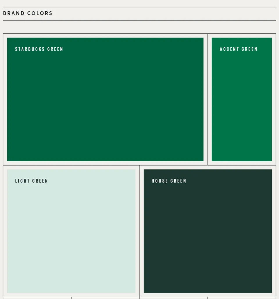
The family of greens from Starbucks Creative Expression; each swatch also carries Pantone, CMYK and hex values. Captured November 15, 2026.
The type page gives each of three typefaces a job: SoDo Sans for most copy, Lander, a serif, for expressive moments, and Pike, a condensed face, for functional headlines and wayfinding. The voice page divides copy the same way. Functional copy handles ordering and wayfinding (“Functional doesn’t mean sterile; it means clear”), and expressive copy introduces featured products.
Every element has a job, and one rule (the greens) applies to every layout, which makes the guide easy to apply to a format it doesn’t cover. Its weak point is upkeep: the site’s security certificate expired on July 23, 2025, so browsers show a warning before it loads and plain requests fail. Further down, it’s also the guide we used to correct an agent’s version of Starbucks.
IBM: write the rules in the palette’s numbers
The IBM Design Language covers type, colour, grid, logos, icons, illustration, photography, data visualisation and motion, with a page of what’s new. Its colour page has the most systematic palette in this list. Ten colour families each run in ten numbered steps, from 10 (lightest) to 100 (darkest), with hex, RGB, Pantone and CMYK values for every step, and the palette downloads as .ase and .clr swatch files.
The rules use the numbers. Gradients stay within approved two-colour families, steps 30 to 60 make vibrant gradients, and colours more than two steps apart don’t get blended, “such as Blue 60 to Teal 20”. IBM’s Carbon Design System then puts the same palette into interface components.
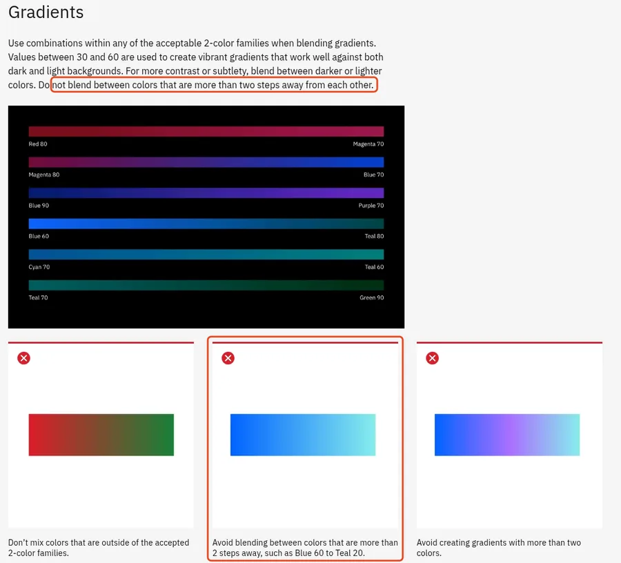
A gradient rule written in palette steps, from IBM’s colour page. Outlines added. Captured November 16, 2026.
Once a palette is numbered, a rule like “no more than two steps apart” is easy for a reviewer, or an agent, to check.
Snapchat: name the fallback fonts
Snap’s brand guidelines page is a short note and a link; the rules are in a 16-page PDF dated September 2025. Two pages stand out. The trademarks page lists the colour yellow itself, “used in connection with mobile applications”, as one of Snap’s marks. And a page of alternate typefaces covers “program limitations for typeface use, such as system applications or Google Slides”: Barlow replaces Program Narrow for headlines, and DM Sans replaces Ghost Sans for body text.
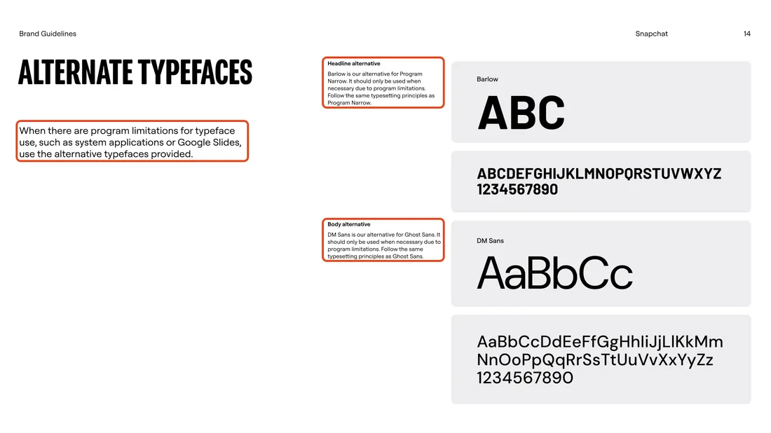
Page 14 of Snapchat’s Brand Guidelines (September 2025). Outlines added. Downloaded November 16, 2026.
Name a fallback for every brand font in your own guide. Slide tools, email clients and agents without your font files can’t use the real typeface, and without a named fallback each one picks its own.
Classic brand books
Before portals, a brand book was a binder: a standards manual that a whole organisation was expected to follow. These three reached past the logo into vehicles, signs and forms.
NASA Graphics Standards Manual, 1976
Richard Danne and Bruce Blackburn designed the worm and its manual in 1975. The manual calls itself “the official policy document regarding NASA identification”, and NASA publishes the January 1976 edition as a free 60-page PDF. It specifies the logotype and its colour, then letterheads, forms, publications, signs, vehicles, aircraft and spacecraft. Its page of incorrect uses draws nine mistakes, from the logotype inside a circle to the logotype stood on end.
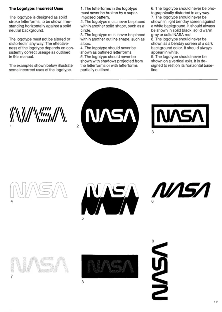
“The Logotype: Incorrect Uses”, NASA Graphics Standards Manual, January 1976. Courtesy of NASA.
The aircraft pages set the blue stripe and the logotype for each of eight aircraft, from a Gulfstream to a Bell helicopter, and say the eight schemes also guide the markings for the rest of NASA’s fleet.
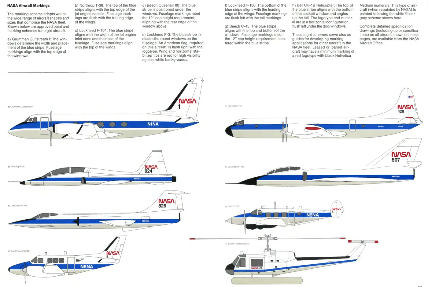
“NASA Aircraft Markings”, NASA Graphics Standards Manual, January 1976. Courtesy of NASA.
NYCTA Graphics Standards Manual, 1970
Massimo Vignelli and Bob Noorda of Unimark designed the New York City Transit Authority’s manual in 1970. It describes the design and construction of the subway’s signs, many of which are still in use. The original screenprinted binder is in the Vignelli Center for Design Studies, which shows it on Google Arts & Culture, and Standards Manual reissued the manual in 2014.
British Rail Corporate Identity Manual, 1965
British Rail’s Design Research Unit issued the first binder in July 1965, covering the basic elements: symbol, logotype, lettering and colour. It set Rail Blue as the colour for trains and adopted the Rail Alphabet typeface, by Jock Kinneir and Margaret Calvert, across the network, and the manual introduced Gerald Barney’s double arrow, which National Rail still uses. Three more binders followed by 1970, covering stations and signs, rolling stock, road vehicles, ships, uniforms and stationery, and amendments ran into the 1980s. Nick Job’s doublearrow.co.uk shows the sheets, with a list that dates every page and marks the superseded ones obsolete, and a 2016 reprint combined the four volumes in one book.
Most of the modern guides above are written for outsiders using a logo. These three governed what the organisation itself put its name on, from vehicles and signs to forms and print, and that is the job your own guide has to do.
Write your own
| Section | What to write | Copy from |
|---|---|---|
| Logo | Each mark’s job, minimum sizes, clear space, backgrounds and what to use when the main one won’t work | Mastercard, Spotify, NASA |
| Names | Spelling, capitals, and correct and incorrect sentences | Figma, Mailchimp |
| Colour | Named colours with a role, values for screen and print, and rules for combining them | Starbucks, IBM |
| Type | Each typeface’s job, sizes and a named fallback | Starbucks, Snapchat |
| Voice | Rules by situation, with approved examples | Starbucks, and the guides in brand voice examples |
| Applications | The formats people actually make, from slides and posts to signs and packaging | GitHub, NASA 1976 |
| Permissions | What outsiders may do, what they may not and who to ask | Figma, Mailchimp, Spotify |
| Changes | What changed and when, and which marks are retired | Mastercard, GitHub |
The Markdown brand guidelines template gives you a file with these sections to fill in, the branding kit checklist lists the files to hand over with it, and a messaging framework covers what the brand may claim. To find the gaps in a guide you already have, ask your agent:
Read our brand guidelines at [link or file]. For each section (logo, names, colour, type, voice, applications, permissions and changes), say whether it gives exact values, shows a wrong example next to the right one, says which mark, colour or font does which job, and names a fallback where one is needed. Quote the passage you’re judging. Then list the three gaps that would most help a designer or an AI agent working from it, and point to a published guide that handles each one well, such as Mastercard’s, Spotify’s or IBM’s.Can an agent read them?
When someone asks Claude for a slide in a brand’s style, or a marketing team’s agent drafts an ad, the agent may go and read the brand’s guide. Many agents read a web page by fetching it, and many fetch tools don’t run JavaScript. Claude’s web fetch tool, for example, “does not support websites dynamically rendered with JavaScript” and accepts only text, HTML and PDF, so a ZIP of logos or a font file is out of reach.
On November 15, 2026 we requested each official guide the way such a tool does, with a plain request and no browser:
| Guide | What a plain request got |
|---|---|
| NASA brand guidelines, Spotify, IBM (colour page), GitHub (logo page), Figma, Mailchimp | The full text of the rules |
| Snapchat | A short page; the rules are in the linked PDF |
| Slack media kit | The page, but its link to the full Slack Brand Center gave a 404 |
| Mastercard Brand Center | Refused (HTTP 403); the site loads in a browser |
| Starbucks Creative Expression | Refused, because the certificate expired on July 23, 2025 |
| Uber (assets.uber.com) | The page title only |
| Netflix (brand.netflix.com) | “You need to enable JavaScript to run this app.” |
| Trustpilot (brand.trustpilot.com) | The page title only |
| Duolingo (design.duolingo.com) | A redirect to a list of design blog posts |
A person can click through a warning or wait for a script to run. A plain fetch tool returns an error or an empty page, and unless the agent also has a browser, it carries on without the guide. This says nothing about how good a guide is (Starbucks’s is one of the best here), only whether an agent gets to read it. If your guide lives in a portal, publish a plain-text or Markdown version of each page and keep logo and font files at stable links; which brand guideline formats AI tools can use compares the options.
Correcting an agent’s version of Starbucks
Often an agent doesn’t read the guide at all. It uses whatever version of the brand someone gave it, and that version can be wrong in ways nobody notices. Rainbrand, the brand layer for agents, keeps a brand’s guidance and files in one maintained place; for each task, a connected agent requests a Brief, the guidance and files that task needs.
Our own Rainbrand account had a Starbucks brand that had been built from starbucks.com, not from Creative Expression. On November 15 we requested a Brief for “a 1080 × 1350 Instagram post announcing a new fall drink” and compared it with the guide. Of the four greens it listed, only one, #00754A, is in the guide; the guide’s own Starbucks Green, #006241, was missing, and so were the rule that brand greens appear in every layout, the Lander and Pike typefaces and the split between functional and expressive copy.
We corrected the brand with an edit. The first attempt, an instruction without the guide attached, stopped to ask for licensed files for SoDo Sans, Lander and Pike, and after we answered that none exist, it proposed no changes. The second attempt attached the guide’s Color, Typography, Logos and Voice pages and a capture of the colour page. Its proposal replaced the palette with the guide’s eight colours and their Pantone and CMYK values, added the green rule, named the three typefaces by role, added the Siren-alone logo rule and the functional and expressive copy split. It also removed the structured heading and body font settings instead of renaming them. We read each changed file, applied the edit, and requested a fresh Brief for the same post on November 16:
| In the Brief | Before the edit (November 15) | After the edit (November 16) |
|---|---|---|
| Greens | #00754A, #00A862, #7CD4B4, #C5DED6 | Starbucks Green #006241, House Green #1E3932, Warm Neutral #F2F0EB |
| The green rule | Not mentioned | “Keep a recognizable Starbucks green in the composition or in the Siren”, with seasonal orange as an accent, not a replacement |
| Typefaces | “So Do Sans” at weight 600, with a font file | SoDo Sans for body use, Pike for condensed headlines, Lander as an expressive accent, named only |
| Facts not given | The drink, its ingredients and flavour notes | The same, plus when and where it’s available |
Three things stayed open. The fresh Brief described the voice as warm and conversational but didn’t name the functional and expressive split, so a guide’s intent can be in the brand without reaching every task. With no licensed font files, an agent can name SoDo Sans but can’t set it, and the guide names no fallback. And the November 15 Brief, along with anything made from it, still carries the old greens: Briefs, exported Skills and finished assets are snapshots, so after an edit you request a new Brief and remake what needs remaking. A Brief also tells an agent what to use rather than guaranteeing it; a Review of a capture of the finished post checks its colours, type, logo and copy and returns a verdict for each, without editing the image.
If you hand your guide to agents, run the same check on one task: request the guidance an agent gets, set it beside the guide, and correct the brand from the guide itself.
FAQ
What is the difference between a brand book, brand guidelines and a style guide?
The terms overlap. A brand book usually means the complete document, often with the brand’s story and strategy as well as its rules; brand guidelines or brand standards are the rules for using the identity; a style guide often means writing style, or a visual specification. NASA called its 1976 book a graphics standards manual and British Rail called its own a corporate identity manual. The name matters less than whether the rules are specific.
How long should brand guidelines be?
As long as the questions people ask. Mailchimp’s public rules fit on one web page, Figma’s logo rules take 11 pages and Snapchat’s 16, and NASA’s 1976 manual runs to 60 because it covers vehicles, signs and forms. If people keep asking the same question, the guide is missing a rule.
Can I use the logos and files in these guidelines?
Only as each guide allows; reading a public guide doesn’t give you permission to use the marks. Mailchimp asks you not to imply a relationship or use its graphics in your own product’s name, Figma allows use that is “truthful, fair, and not misleading”, and NASA’s marks can’t be used outside the agency without explicit permission.
Why do some companies keep their brand guidelines private?
Public guides are mostly written for outsiders: merchants showing a payment logo, developers building on a platform, press and partners. Guidance for a company’s own campaigns, packaging and stores is written for staff and agencies, and often stays internal. When ManyPixels checked 25 well-known brand books in September 2026, five had never been published, all from consumer brands.
More in Brand guidelines
All 18 Brand guidelines articles10 min read
Branding kit checklist: what to include, file formats and real examples
What a branding kit should contain, from logo files and colour values to fonts, templates and rights; what to agree with your designer; what real companies’ kits hold; and a bounded web sample kit, with its index, a template and an asset made from it.
11 min read
Logo usage guidelines: what to include and how to write them
Logo usage guidelines say which logo goes where, how much space it needs, how small it can go, which colours and backgrounds it allows and what never to do. See how Amazon and Strava write each rule, how AI tools get logos wrong, and a template to download.
14 min read
How to make brand guidelines AI-ready
AI-ready brand guidelines give an agent rules it can apply without guessing, the real logo and font files, and the current version. Rewrite each rule without inventing policy, keep the guide's own decisions apart from your suggestions and the questions only the brand owner can answer, then test the rewrite on a real task.