By Siddharth Borderwala
Published
9 min read
What are brand elements? Ten examples, how to choose them and what agents need
Brand elements are the parts of a brand people recognise: name, logo, colour, type, slogan, voice, imagery, sound, character and shape. Real examples of each, Keller's six criteria with a documented choice and an evidence worksheet, and the rule, file and example an AI agent needs for every one.
TL;DR
Brand elements are the parts of a brand people use to recognise it: name, logo, colour, typography, slogan, voice, imagery, sound, characters, and shape or packaging. Choose each to be memorable, meaningful, likable, transferable, adaptable and protectable. For AI agents, every element needs a written rule, the real file where one exists and an example of it used well.
What brand elements are
Brand elements are the individual pieces of a brand that someone can see, hear or say: the name on the door, the mark on the app icon, the colour of the packaging, the sound before a film. Kevin Lane Keller's textbook, Strategic Brand Management, gives them a chapter of their own, “Choosing Brand Elements to Build Brand Equity”. Each one is a deliberate choice, and most are hard to change later.
They sit between two neighbouring ideas. A brand identity is the whole of how a brand presents itself, including how it behaves. Brand assets are the files and fixed material that carry the elements, such as the logo SVG or the font file. The elements are the components in between, and the rules for combining the visual ones make up a visual identity system.
Ten brand elements, with real examples
Bynder's brand elements glossary lists eight, with few named brands. Here are ten, each with a documented example:
| Element | Example |
|---|---|
| Name | Dunkin' Donuts announced in 2018 that it would become Dunkin', with drinks making up about 60% of its sales. |
| Logo | innocent's lowercase wordmark sits above a face with a halo known as the “Dude”, which its 2024 packaging made the focal point again. |
| Colour | Cadbury's attempt to register its purple, Pantone 2685C, for packaging was refused by the UK Court of Appeal in 2013 as too imprecise. |
| Typography | IBM has its own type family, IBM Plex, “distinctly IBM” and free to download. |
| Slogan | L'Oréal Paris's “Because I'm Worth It” was written in 1971 by Ilon Specht at McCann. |
| Voice | Our innocent page says to write “like a person” and to keep the name lowercase, even in copy. |
| Imagery | Patagonia's photography shows real outdoor use and product care, covered in what is brand identity. |
| Sound | Netflix's “ta-dum” debuted in 2015, once Netflix made its own shows. A goat's bleat was an early candidate. |
| Character | Duolingo reshaped its owl, Duo, in 2013 for “a single consistent design”, keeping his colour and species. |
| Shape and packaging | In 1915 Coca-Cola asked glassmakers for a bottle people could recognise by feel in the dark, and got the contour bottle. |
Logos get most of the attention, so here are two of the others, as their owners present them. IBM introduced its own typeface, IBM Plex, on its own page, set in the face itself:
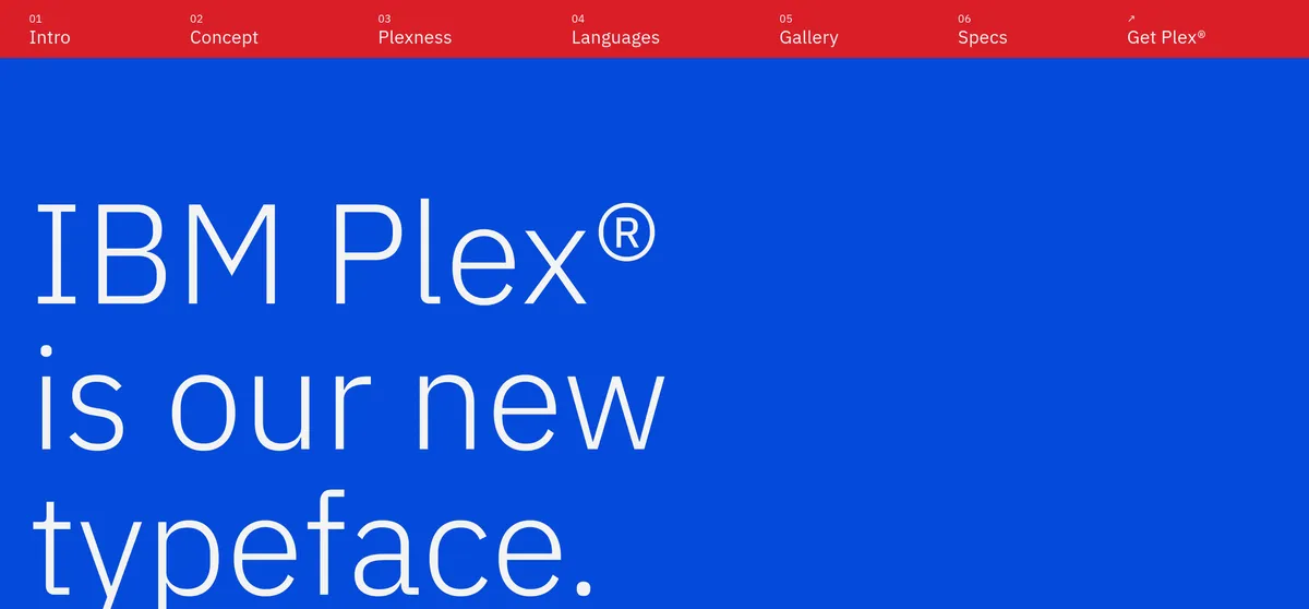
IBM's introduction to IBM Plex, from ibm.com/plex, captured November 16, 2026
And Duolingo published the shapes it tried when it redrew Duo in 2013. It fixed two things before starting, his colour and his species, and explored the rest for months:
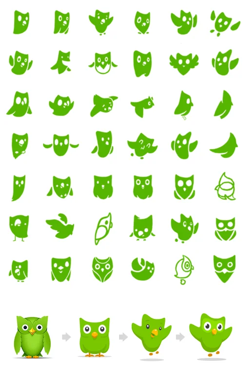
Duo's candidate silhouettes and the path from the old owl to the new, from Duolingo's “Reshaping Duo”, November 20, 2013
How to choose brand elements
Keller sets out six criteria for choosing an element. The first three build the brand; the last three defend it. Familiar brands illustrate each one, but only in hindsight:
| Criterion | The question | Seen in a familiar brand |
|---|---|---|
| Memorable | Will people recognise and recall it? | A bottle you can identify by touch in the dark |
| Meaningful | Does it say something about the category or the benefit? | “Donuts” in Dunkin' Donuts, which described the original product |
| Likable | Do people enjoy it for its own sake? | Netflix wanting a sound that says “I'm about to get a treat” |
| Transferable | Does it work in new categories and countries? | Dropping “Donuts” once the business sold mostly drinks |
| Adaptable | Can it change without losing what people recognise? | Duo's 2013 redesign, keeping the owl and the green |
| Protectable | Can you defend it legally and against competitors? | Cadbury's purple, refused as worded |
The criteria pull against each other. A meaningful name is often a less transferable one, which is exactly the Dunkin' story: the word that once described the product later held the brand back. A colour can be memorable and still hard to own, as Cadbury found. Choosing elements means deciding which of these trade-offs you can live with for years.
A choice made in the open: Netflix's sound
Hindsight hides the hard part, which is picking between candidates before anyone knows which will last. Netflix's sound logo is one of the few choices documented step by step, by the people who made it, in a Twenty Thousand Hertz episode:
- The requirements came first. Todd Yellin, who led the project, wanted a sound that would make people think they were about to get a treat. It had to be very short, because people at home aren't a captive cinema audience, and it had to build tension and release it in about three seconds.
- There were many candidates. The sound designers tried countless options. One finalist ended on a goat's bleat, which Yellin liked for a while as quirky; another was more electronic.
- The test asked what each sound meant, not which was liked. Netflix ran an anonymous survey with thousands of people, who weren't told what the sounds were for. Each person heard one sound and said what words came to mind. A bubbly candidate drew “curious” and “relaxed”, but also “confused”. The ta-dum drew “dramatic”, “beginning” and “short”, and the most common word by far was “movie”.
- The last call was a person's. After about a year, Yellin played the five remaining sounds to his ten-year-old daughter, who picked the ta-dum without hesitating.
Asking people which option they like measures taste. Asking what an option makes them think of tests whether it means what the brand needs it to mean.
An evidence worksheet
Here is the same discipline as a worksheet for your own candidates. It lists the test, who to test with and what a result would change, without scores, because the decision is a judgement about trade-offs:
| Criterion | What to test | With whom | What a result would change |
|---|---|---|---|
| Memorable | Show each candidate briefly among competitors' cues, then ask people to pick it out later | People who buy in the category, not your team | If few can pick it out, simplify it or make it more distinct before launch |
| Meaningful | Ask what it brings to mind, without naming the brand | Category buyers, unprompted | If the words don't match the positioning, drop it; “confused” counts as a fail |
| Likable | Ask how it makes people feel after several exposures, not one | The same buyers, over repeat exposure | If it irritates on repeat, it won't survive being everywhere |
| Transferable | Check its meaning and pronunciation in each market and category you plan to enter | Native speakers and buyers in those markets | If it means something unwanted there, change it before it spreads |
| Adaptable | Try it at app-icon size, in one colour, in motion and in print | Your designers, in the formats you actually use | If it breaks at the smallest size, simplify the shape, as Duolingo did with Duo |
| Protectable | Run a trademark search and get a view on registering it as described | A trademark lawyer | If it can't be registered as described, change the description or the element |
What an agent needs for each element
People learn a brand's elements over months, by seeing them used and being corrected. An AI agent making an asset learns only what its task hands it. So each element needs three things written down: a rule someone else can apply, the file where one exists, and an example of it used well.
| Element | Rule and file | Example to include |
|---|---|---|
| Name | Spelling, capitalisation and trademark symbols; product names and how to shorten them | A sentence with the name used correctly |
| Logo | Which version where, clear space, backgrounds, minimum size; an SVG of each version | One right and one wrong placement |
| Colour | Exact values, each colour's job and rough proportions | A layout that shows the proportions |
| Typography | Roles, weights and sizes; the font files and a specimen | A page set in the real fonts |
| Slogan | The exact words and where the line may appear | An approved use |
| Voice | Decisions a writer can follow, and words to use or avoid | Approved copy and an edit that fixed a draft |
| Imagery | Subjects, style and what is off-limits; the approved photos | A right and a wrong image, side by side |
| Sound | When it plays and when it doesn't; the audio files | A cut that uses it |
| Character | Allowed poses and expressions, and that agents place the approved art rather than redraw it; the source art | Approved scenes |
| Shape and packaging | Current packs and products; photos or renders of each | Current pack shots |
One element, from rule to file to task
innocent, the smoothie maker, is a brand whose elements are mostly character and voice. Our innocent page sets the rule for its logo and its haloed face, known as the dude: “Don’t redraw the dude or retype the wordmark in another font; the hand-drawn shapes are part of the character.”
Rainbrand keeps a brand's rules and files as shared context for agents, and returns what one task needs as a Brief. On November 16, 2026 we asked for one for a concept Instagram post announcing a mango and passion fruit smoothie, and asked directly whether the dude could appear on his own. The Brief answered with the rule, the files and a limit:
So, if “the dude” means the haloed face, yes: the supplied face mark may appear on its own as a standalone identity mark; this does not establish a separate, unrestricted mascot-use policy.
It linked the green SVG lockup and a face-only icon, and the Innocent Sans font files in Bold for the headline and Light for the copy. It also found a problem in the brand's own files: the tiny off-white face was labelled as the primary wordmark and the full green lockup as the icon, the wrong way round. It told the agent which file to use for which job, and to check with the brand owner if production depends on the labels.
That is the chain an agent needs for every element: a rule it can apply, the file the rule refers to, and an answer to the question the task actually raises. Without it, the dude gets redrawn, the wordmark gets retyped, and whichever file is labelled “wordmark” goes on the post. The elements that most need this are the ones a model will otherwise invent with confidence: the logo, the typefaces and any character.
FAQ
Which brand elements matter most?
The name and logo carry the most recognition for most brands, but that varies. For innocent, the character and voice carry much of it; for Coca-Cola, the shape of the bottle does. The useful question is which elements your customers actually recognise you by.
Can a colour or a sound be trademarked?
Sometimes. Tiffany & Co. registered its blue in 1998, while Cadbury's attempt to register its purple failed in the UK Court of Appeal in 2013 because of how the mark was described. What can be protected depends on the country and the precise description, so take advice from a trademark lawyer.
How often should brand elements change?
Rarely, and carefully, because recognition builds slowly. When an element does change, keep the parts people recognise, as Duolingo did with Duo, and replace the old version everywhere it is recorded, including the guidance AI agents use. Brand management covers who owns changes like these.
More in Brand guidelines
All 18 Brand guidelines articles18 min read
Brand guidelines examples: 12 real brand books and what to copy from each
Twelve brand guidelines you can open today, from Mastercard’s logo rules to NASA’s 1976 standards manual, with the exact rule worth copying from each, which ones an AI agent can read, and what it took to correct an agent’s version of Starbucks.
10 min read
Branding kit checklist: what to include, file formats and real examples
What a branding kit should contain, from logo files and colour values to fonts, templates and rights; what to agree with your designer; what real companies’ kits hold; and a bounded web sample kit, with its index, a template and an asset made from it.
11 min read
Logo usage guidelines: what to include and how to write them
Logo usage guidelines say which logo goes where, how much space it needs, how small it can go, which colours and backgrounds it allows and what never to do. See how Amazon and Strava write each rule, how AI tools get logos wrong, and a template to download.