By Siddharth Borderwala
Published
11 min read
What are brand assets? Types, examples and what AI agents need
Brand assets are the files and recognisable cues a brand uses and protects, from logo files and fonts to a signature colour. The main types, which ones agents need and in what form, distinctive brand assets, a winery's label faces as a worked example, and an inventory sheet.
TL;DR
Brand assets are the files and recognisable cues a brand uses again and again: logo files, fonts, colour values, photography, illustration, templates, set copy and sound. The most valuable are distinctive assets that people link to the brand on sight. AI agents need the original files with rules for each, or they redraw, substitute and invent.
What counts as a brand asset
The phrase has two meanings, and both matter.
Day to day, brand assets are the files a brand uses: the logo in every version, the font files, the colour values, the approved photographs, the templates. Bynder's glossary calls them the files and resources that shape a brand's look and feel, and Brandfolder's list of 12 types runs from the name to the packaging.
In marketing research, a distinctive brand asset is something narrower: a cue other than the name that people link to one brand. Jenni Romaniuk of the Ehrenberg-Bass Institute, who wrote the 2018 book Building Distinctive Brand Assets, says they “can be anything sensory”: shapes, colours, faces, words, fonts, moments, sounds.
The two meet in practice. A brand's distinctive assets are only as safe as the files and rules that carry them. A logo is an element of the identity; the SVG of that logo, at the right version, is the asset someone actually places.
This page covers what the assets are, which ones matter most and how to keep a usable inventory. For getting the same set to every agent and tool, see sharing brand assets across AI agents.
Types of brand assets
Brandfolder's list of 12 types is a good inventory: name, logo, colour palette, tagline, iconography and illustration, typography, website, brand voice, mascot, sound, social assets and packaging. Add photography and templates and you have the working set most brands use. Each one is something real, and for an AI agent each needs to arrive in a particular form:
| Asset | A real example | The form an agent needs |
|---|---|---|
| Brand name | LEGO asks for its name as an adjective with ®: “LEGO bricks”, never “LEGOs” | The exact spelling, capitals and marks, written down |
| Logo | Gut Oggau's wordmark, set in its own Sketch font (below) | An SVG of each version, named for when to use it |
| Colour palette | Tiffany's blue, made by Pantone as a custom “1837 Blue” (below) | Exact values and each colour's job |
| Tagline | L'Oréal Paris's “Because I'm Worth It”, written in 1971 | The exact words, and where the line may appear |
| Typography | Gut Oggau's two custom typefaces, supplied to agents as web font files | Font files licensed for the use, plus a specimen image |
| Iconography, illustration | Extropic's technical charts, given to agents as style references for live graphics | Source files, and a rule on how each may be used |
| Website | Patagonia's own site, which loads its Ridgeway Sans typeface | The live site as a source, checked against the guidelines |
| Brand voice | Aesop's voice, written as rules with quoted lines (brand identity) | Voice rules plus approved copy |
| Mascot or character | Friedhats' jar character, supplied in its Brief so a film could animate the brand's own drawing | Source art, ideally in several poses |
| Sound | Netflix's “ta-dum”, introduced in 2015 | Audio files, and where they may play |
| Social assets | Eager's own range photo, reused on the first slide of its concept carousel | Profile images, templates and approved photos |
| Packaging | Eager's cartons: one colour per flavour, the fruit's name set vertically (visual identity system) | Current photos or renders of each pack |
| Photography | Patagonia's photos of gear in use and being repaired | Full-resolution originals, labelled with what each shows |
| Templates | Slide, social and document layouts | Editable files with the fixed parts marked |
The pattern is that an agent needs the asset itself, not a description of it. A sentence such as “our logo is a blue wordmark” invites the model to draw one. With nothing to place, an agent fills the gap from what it has seen elsewhere, and the result is usually close enough to look plausible and wrong enough to notice:
- A redrawn logo. When Cursor generated a launch image for the electronics brand Nothing, the generated wordmark lost its registered mark; the fix was to place the original file (the full case).
- A substituted font. For Heart Aerospace, Claude built a five-slide PowerPoint deck from a Brief that linked Neue Haas Grotesk's font files. The deck names the font but doesn't embed it, so the type shows in that face only on computers that have it installed (the full case). Everywhere else, PowerPoint substitutes another typeface.
- An invented product shot. For the London bao brand Yumbun, there was no photo of one dish, so the agent generated it (the full case). That can be fine for a concept, but it is a new image, not an approved one.
- The wrong file in the right slot. A brand's own asset list can be wrong, which is the Gut Oggau example below.
Distinctive brand assets
Romaniuk's test for a distinctive asset has two parts: fame, meaning how many buyers in the category link the cue to the brand, and uniqueness, meaning whether it points to that brand alone. Both are measured by surveying category buyers: show the cue without the name and ask which brand it brings to mind. A cue that is famous but shared with competitors (a generic green leaf on an organic product) is weak. A cue that is unique but known only to the design team isn't distinctive yet.
Tiffany & Co. shows what a strong one looks like. Its founder, Charles Lewis Tiffany, chose the blue in 1845 for the cover of the company's Blue Book catalogue. Tiffany trademarked the colour in 1998, and Pantone made a custom shade for it, called “1837 Blue” after the year the company was founded, so that it is “always the same” wherever it appears.
That last phrase is the point for anyone giving assets to agents. Distinctive assets are the ones that must never be approximated, because a near-miss is no longer the asset. A close blue is just a blue, and a redrawn character is a different character.
A worked example: Gut Oggau's label faces
Gut Oggau is a family winery in Burgenland, Austria. Each of its eleven wines is a member of a fictional family across three generations, and each label carries a drawn portrait of that wine's personality. The faces are its most distinctive asset.
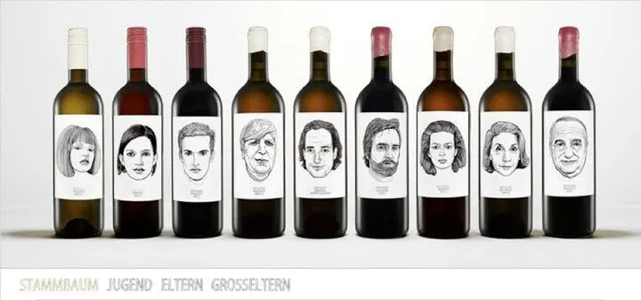
Gut Oggau's label faces, from the brand's files. This group photo shows nine of the eleven wines.
Claude, connected to Rainbrand, was asked to make three pieces from the brand: a two-sided paper runner for the long tables at the winery's Heuriger, a 20-second vertical film in which the faces draw themselves, and a concept gift box with one wine from each generation. Rainbrand keeps a brand's guidance and files and returns the ones a task needs as a Brief. The Briefs for this example did three things with the assets.
They supplied the faces as files and said how to treat them: “use the original label artwork rather than redrawing or swapping faces”. They also noticed that the group photo above shows only nine bottles, “so it is not a complete-family source”, and supplied a separate label photo for each of the eleven wines, so every face could be matched to its name.
They also caught a wrong file. Gut Oggau's brand had been added from its website, and the logo slot held a photo of the owners:
The pinned package does not contain a usable standalone wordmark file: its catalog “primary logo” points to a photograph of a couple, not wordmark artwork. Do not use that photograph as a logo or substitute wine-family faces for the mark.
Claude set the GUT OGGAU wordmark in the brand's own Gutoggau Sketch font, the way gutoggau.com does, and used it as the logo reference. Rainbrand's Review of the final runner, film end card and box layout found the wordmark matched it. Claude then applied a brand edit that made the wordmark the primary logo and moved the photo to the estate imagery. Here is the inside of the box lid, with all eleven faces matched to their names from the label references:
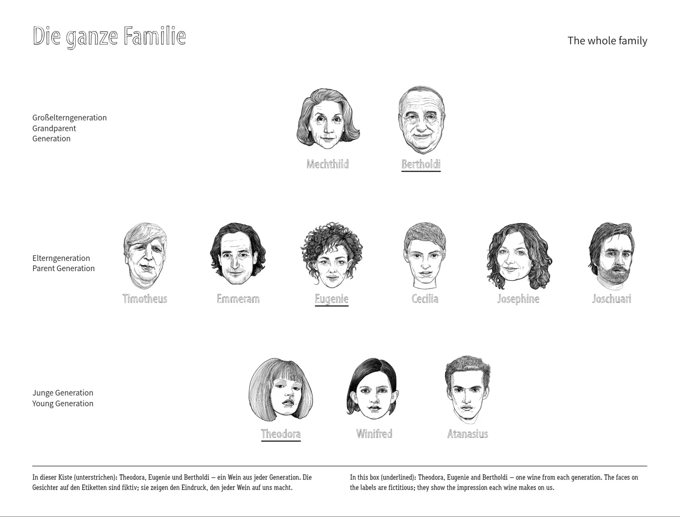
The concept box's inside lid, made by Claude for the Gut Oggau example
The lesson goes beyond wine. An asset list is only as good as its worst file, and agents will use what is in the slot. Correcting the brand fixes the slot for what comes next: any task that requests a fresh Brief after the edit gets the wordmark. It doesn't reach back. The Briefs made before the edit still point at the photo, and so would a Brand Skill exported before it or a copy of the guidance saved in another tool. Those have to be replaced too.
Name, store and version assets
Most asset problems aren't missing files. They are three versions of the same file with no way to tell which is current. People can ask; an agent picks whichever it finds. Four habits prevent most of it.
Name files for what they are and when to use them. A name should say the brand, the asset and the variant, such as the background it is made for, so the right file is obvious without opening it. Eager's two wordmark files, as supplied in its Brief, follow the pattern:
brand-asset-variant.format

eager-wordmark-white.svg
eager-wordmark-green.svg
gut-oggau-wordmark.svg
Keep version numbers and words such as “final” out of file names. They multiply, and nobody knows whether final-v3 beats final-new. The version belongs in the record, not the name.
Keep one current set in one place. Approved files live in one library, whether that is a digital asset management system, a shared drive or a brand tool; drafts, rejected options and one-off outputs live somewhere else. Rainbrand's Brand Library works this way: generation experiments and one-off outputs stay outside it unless someone adds them.
Describe each file. Write what it shows, whether it is current, where it may be used and any licence limits. Agents rely on those descriptions when they choose files; the Gut Oggau Brief, for instance, flagged that one group photo showed only nine of the eleven wines.
Retire old versions everywhere. When a logo, pack or photo changes, archive the old file with its dates and remove it from every place people and agents look, including shared drives and copies inside AI tools. In Rainbrand, you can remove a file from the Brand Library without deleting it. Updating brand guidelines across AI tools covers finding the copies.
An inventory sheet
Those habits need a record. One row per asset is enough: where the file came from, which file is current, what it may be used for, when to look at it again, and what happens when it changes. Here are four rows for Gut Oggau. The first four columns come from the example's records; the last two are what we would write:
| Asset | Source | Current file | Allowed use | Review by | When it changes |
|---|---|---|---|---|---|
| Wordmark | Set in the brand's Gutoggau Sketch font, as on gutoggau.com | The SVG Claude set and added to the Library | Primary logo | None recorded | Brand edit, then fresh Briefs; replace saved copies |
| Founders' photo | The brand's website | The original photo | Estate imagery only, never as the logo | None recorded | Moved out of the logo slot by a brand edit |
| Label faces | One label photo per wine | Eleven photos, one per wine | Placed as drawn; never redrawn or swapped | When a new wine joins the family | Add the new label; keep the old ones for reference |
| Group photo | The brand's files | One photo of nine bottles | Mood and context; not a source for the whole family | None recorded | Replace when a complete group shot exists |
“None recorded” is the honest answer for most brands, and it is the column worth filling first: a photo with a model release, a font licence or a campaign line with an end date can stop being usable without anyone touching the file.
Before an agent uses your assets
Most of what makes assets usable for agents is housekeeping a design team already knows. These are the checks that matter most:
Your asset set
- Every logo version is a vector file, named for when to use it, with no photos or app icons in the logo slot.
- Font files are present, licensed for how agents will use them, and paired with a specimen image.
- Colour values are written down with their roles, not left in screenshots.
- Each photo says what it shows, whether it is current, and what it may be used for.
- Characters, label art and illustrations carry a rule that they are placed as drawn.
- The brand name's spelling, capitals and marks are written down.
- Retired versions are removed, so an agent can't pick last year's logo.
If your files live in a digital asset management system, what a DAM gives agents covers what they can reach there. If you are starting from scratch, brand management explains who should own the set and keep it current.
FAQ
What is the difference between brand assets and digital assets?
Digital assets are any files an organisation stores, including product shots, campaign files, documents and video. Brand assets are the subset that represents the brand and is reused across campaigns and channels. A digital asset management (DAM) system usually holds both.
What is a brand kit?
A brand kit is a packaged set of brand assets, usually the logo files, colour values, fonts and a short guide, given to a designer, agency or tool. It works best when each file comes with its rule, so whoever uses it knows which logo goes where.
Should brand assets be trademarked?
Names and logos usually are, and some brands register other distinctive assets: Tiffany registered its blue in 1998. What can be protected varies by country and by asset, so take advice from a trademark lawyer for your own brand.
More in Images and design
All 10 Images and design articles10 min read
Creative brief template: free download with design and campaign brief versions
A free creative brief template in Word and Markdown, with design and campaign brief versions, a completed example from a real concept with its unknowns marked, what to write in each section, and the gaps real briefs leave open.
11 min read
How to keep AI ads on-brand across markets
We made one ad for two markets, the US and Japan, and recorded every decision. Keep the photo, logo and layout identical, take each market's words and prices from its own page, choose a font for each script, and check every version before someone in the market approves it.
11 min read
How can non-designers make on-brand assets without a designer?
Marketers, founders and salespeople can make everyday assets on-brand if a template holds the design and they change only the words and photo. A complete example, from a failed AI-made post to an editable template and two exported versions, with what the brand settled, what the template settled and what the checks found.