By Siddharth Borderwala
Published
11 min read
How to keep AI ads on-brand across markets
We made one ad for two markets, the US and Japan, and recorded every decision. Keep the photo, logo and layout identical, take each market's words and prices from its own page, choose a font for each script, and check every version before someone in the market approves it.
TL;DR
Decide what is identical in every market before anyone makes an ad: usually the photo, the logo file, the palette and the layout. Take each market’s words, prices and offers from that market’s own approved source rather than translating another market’s ad. Generate the image without text, set each language in a font that covers its script, check every version against the brand, and have someone in the market approve what runs there.
One ad, two markets
OpenAI’s ad for a Creative Lead, Japan, posted in October 2026, describes a job most global brands now do at volume: “define how global ideas are translated, adapted, and evolved for Japan”, “with close attention to Japanese language, typography, and visual expression.” AI makes the volume easy. It also makes it easy for the twelfth market’s ad to stop looking like the first.
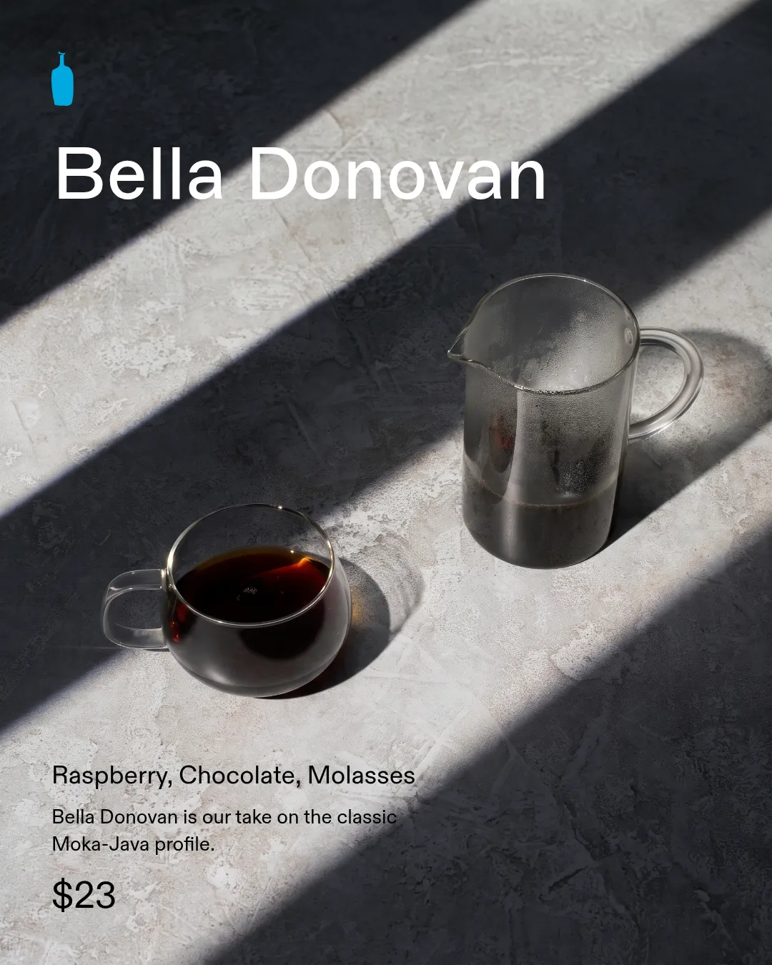
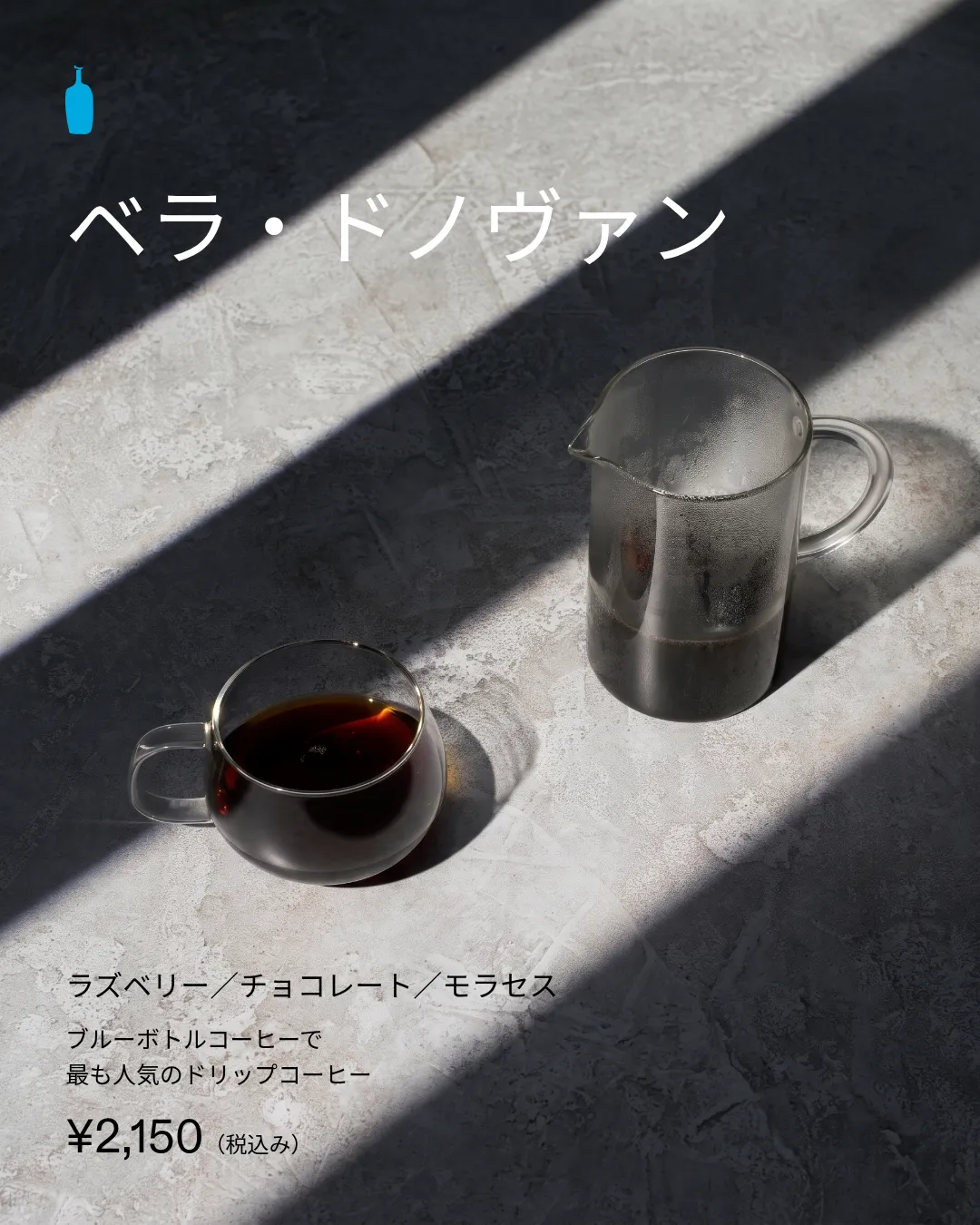
To see what that takes in practice, we made one Instagram ad in two versions, for the United States and Japan, on November 16, 2026. It promotes Bella Donovan, a coffee blend Blue Bottle Coffee sells in both countries. It’s a concept ad we made for this article.
We used Rainbrand, which gives AI agents a brand’s guidance and files, for the brand context. A Brief is the guidance and files for one task; a Review checks a captured image against the brand and returns a verdict and a reason for each check. We generated one photo with no text in it through Rainbrand, set each market’s text over it in HTML with the brand’s own font files, captured both, and had each one reviewed.
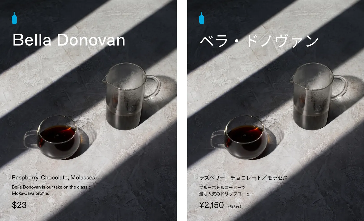
Concept ad pair, second versions. Same photo, logo, canvas and layout; each market’s own words and price. Japanese font unapproved.
The full-size US ad and Japanese ad are 1080 × 1350. The rest of this article is what we decided at each step, what went wrong, and the filled sheet you can copy.
Decide what stays the same
If nobody says which parts are fixed, an agent asked for “the Japanese version” guesses. We wrote the split down before making anything:
| Element | Identical in both | Set by each market |
|---|---|---|
| Photo | One generated photo, same crop | Nothing, because it shows only objects |
| Canvas | 1080 × 1350 | Nothing |
| Logo | The bottle mark SVG in #00A9E0, same spot | Nothing |
| Layout | Name at the top, details at the bottom | Line breaks, so Japanese doesn’t wrap mid-phrase |
| Product name | The product | How it’s written: Bella Donovan or ベラ・ドノヴァン |
| Description | Nothing | Each market’s own line, from its own product page |
| Price | Nothing | $23, or ¥2,150 with tax included |
| Fonts | The roles: heading, supporting text | A font for each script |
| Call to action | Left out of both | Needs approved wording in each market |
Brands with explicit rules for this are worth copying. Apple’s marketing guidelines supply App Store badges in 50 localisations and say: “The service mark App Store always appears in English. Never translate App Store or create your own localized badge.” If your brand has a mark like that, put it in the left column.
Take each market’s words from its own page
The Brief said the task, not the brand, sets each market’s strings, and told the agent: “Keep them market-local; do not translate one market’s claim into the other or convert the prices.” That turned out to matter, because Blue Bottle’s two product pages don’t describe the same coffee in the same way:
- The US page labels Bella Donovan “Dark Roast”. The Japanese page gives its roast as バランス (balanced) and calls it 少し浅めの焙煎度合 (a slightly lighter roast).
- The Japanese page calls it ブルーボトルコーヒーで最も人気のドリップコーヒー, the most popular drip coffee at Blue Bottle. The US page doesn’t make that claim.
- The Japanese price, ¥2,150, includes consumption tax and is shown that way. The Japanese page also marks the bag as part of a holiday coffee offer.
A translated US ad would have called the coffee dark-roasted in Japan and missed the claim the Japanese team chose to lead with. We took every word in each ad from that market’s page, left the roast out of both, and left the holiday offer out because its terms weren’t in front of us. Neither page gave us call-to-action wording, and the Brief said not to invent one, so neither ad has a button.
Give each script a font, and record who chose it
The brand’s fonts are ABC Marfa for headings and ABC Diatype for supporting text. The Brief named them for Latin text and then said:
“No Japanese typeface is specified in the brand materials. Do not assume the Latin fonts provide Japanese glyph coverage.”
The Brief didn’t claim the fonts lack Japanese; it said that support wasn’t established. We checked the two font files it linked, and neither contains Japanese characters. Blue Bottle’s Japanese store doesn’t settle the question either: it loads two Latin fonts, Figtree and Jost, so its Japanese text appears in whatever font the reader’s device supplies.
So we chose Noto Sans JP, an openly licensed Japanese font, as a stand-in and marked it as not approved. The first Japanese version used Noto Serif JP for the name and price and a single long description line. Its Review failed typography:
“Price numerals use a serif instead of ABC Diatype. Requested Noto Japanese fonts have no approved fallback guidance.”
Looking at it ourselves, we found two more problems the Review didn’t flag. ABC Marfa is a sans-serif, so a serif Japanese name doesn’t do the same job as the English heading. And the long description ran into the photo’s shadow, where black text is hard to read. The US version had its own type failure: we’d set the price in ABC Marfa, and the Review said its dollar sign didn’t match ABC Diatype.
The second versions set all Japanese text in Noto Sans JP, set both prices in ABC Diatype, and broke the Japanese description into two lines that stay on the light part of the photo.

Japanese version, first and second. The serif price failed the type check; the long line running into the shadow was our own catch.
The second Japanese Review returned typography as uncertain, not passed: “The price matches ABC Diatype Regular. Requested Noto Sans JP is an unapproved Japanese fallback; brand-owner approval is still needed.” That’s the right answer. A check can confirm which font is on the page, but only the brand owner can approve a font for Japan. Until someone does, the sheet records the stand-in as unapproved.
Whatever the script, set the text over the image rather than asking an image model to draw it. A model that renders the Japanese itself redraws the characters as shapes, and you get a different picture for each language. Set as text, the words are exact and editable. Plan for length too: the W3C’s guide to text size in translation, citing IBM’s figures for English into European languages, says text of up to 10 characters can grow to two or three times its length. Ad headlines are short, so they grow the most.
Fix shared problems in the brand, once
The first Brief gave the logo as “an icon-only, 160 × 160 JPEG” on “an opaque white background”, and warned: “Because this file has a white background, do not assume it can be placed transparently over the photograph; obtain an approved transparent/high-resolution version if that is needed.” On a photo, that file would have meant a white square behind the logo in both markets.
Blue Bottle’s own website serves the same bottle mark as a transparent SVG. We added that file to the brand’s library and edited the brand to make it the primary logo, with a note to place it without a backdrop. Rainbrand prepared the edit, we checked what it would change, and applied it. A Brief is a snapshot of the brand when it’s made, so we then asked for a fresh one. The new Brief gave the SVG and its exact colour, #00A9E0, and both markets used that one file. The logo passed in all four Reviews.
That’s the pattern for anything every market shares. Fix it in the brand, then request new Briefs, rather than patching each market’s file.
The filled market sheet
Each market needs one place for the facts the brand doesn’t hold. Here is ours for this pair. The market sheet has the same example and a blank version to copy.
| Field | United States | Japan |
|---|---|---|
| Copy source | US product page | Japanese product page |
| Product name | Bella Donovan | ベラ・ドノヴァン |
| Description | The Moka-Java line, as on the page | ブルーボトルコーヒーで最も人気のドリップコーヒー |
| Price | $23 | ¥2,150(税込み) |
| Left out on purpose | “Dark Roast” | The roast label and the holiday offer |
| Heading font | ABC Marfa Regular | Noto Sans JP Regular, not approved |
| Supporting font | ABC Diatype Regular | Noto Sans JP; price in ABC Diatype |
| Call to action | None approved | None approved |
| Legal lines | To confirm with the market | To confirm with the market |
| Final Review | Logo, copy pass; colour, type uncertain | Colour, logo, copy pass; type uncertain |
| Open decisions | A CTA, legal lines, an approver | The font, a CTA, legal lines, an approver |
| Local approver | None; this is a concept | None; this is a concept |
The US version’s two uncertain verdicts were about what the check could see. The Review couldn’t confirm the white and black of thin text over the photo, or confirm ABC Marfa from the pixels. We resolved both from the source file: the text is set in #FFFFFF and #000000, and the heading uses the ABC Marfa file the Brief supplied. That’s the usual way to handle an uncertain verdict. Someone looks at the thing the check couldn’t see and records what they found.
Check in order, then hand over to the market
Split the checks by what each person can judge, and run them in this order so the market reviewer isn’t spending time on a wrong logo:
- A brand check on every version for logo, colour, type and copy, against the same global brand. A Review does this for each captured image and reports; it doesn’t change the asset.
- A native speaker in the market for language, register and anything culturally off.
- Whoever owns legal and platform rules in that market, for claims, prices and required lines.
Keep the same brand check across every market. Drift then shows up as a pattern, such as one market’s ads always coming back uncertain on typography, which usually means its sheet is missing an approved font.
The third step varies more than people expect. Google’s alcohol ad policy, for example, tells advertisers to understand “local legal restrictions on what products can be advertised,” limits Iceland’s alcohol ads to products up to 2.25% alcohol by volume, and allows only branding and informational ads for beer in Poland. An ad that’s fine in one market can be refused in the next.
When a market already has approved copy
Where a brand already publishes approved copy in each language, the job is smaller: reuse it rather than translate. In Rainbrand’s Gut Oggau example, Claude made a paper table runner for an Austrian winery, read from both benches, with German facing one side and English the other. Each side takes its wine descriptions from Gut Oggau’s own German and English pages, and the faces, names, wordmark and layout are the same on both.
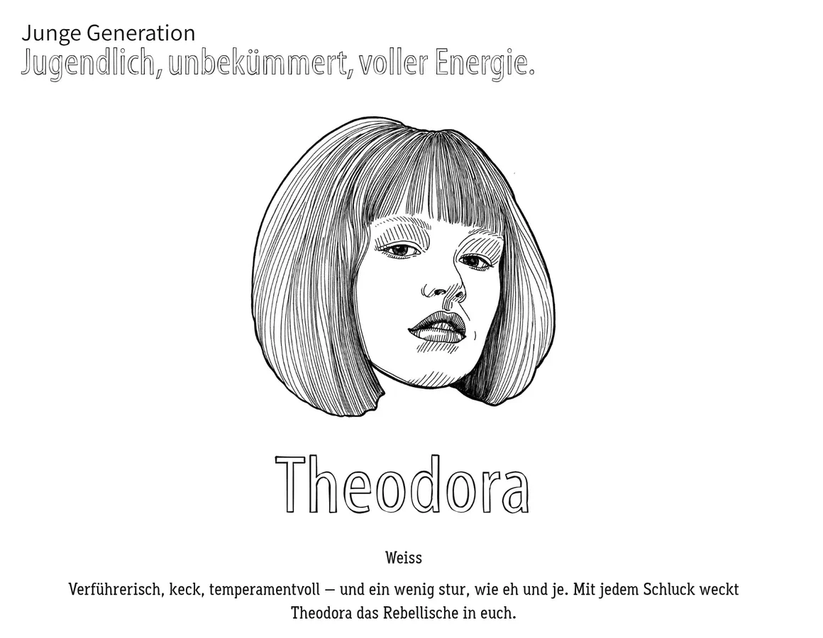
Part of the reviewed section: the young generation, on the German side.
The Review covered one section, not the whole German side. Its saved record, runner-de-1, holds the German introduction and the young generation, three of the side’s eleven faces. In the last round that checked copy, it returned: “All headings, descriptions, and labels match the requested text verbatim with correct German grammar and spelling, fitting the brand voice.” The other sections had their own records.
Adapt the picture when people are in it
The Bella Donovan photo was reused in both concepts because it shows only a mug, a pitcher and sunlight. Once people or places appear, decide for each market:
- who appears, and whether they look like the people who’ll see the ad;
- the setting, from street furniture to kitchens;
- the season, since a northern summer launch runs in winter in Australia;
- holidays, gestures, numbers and colours that read differently there.
Use approved local photography as the reference rather than letting the model invent people and places. That judgement belongs to someone who lives in the market.
FAQ
Can AI translate our ads?
AI can draft a translation, but a native speaker should write or approve the final copy. Start from the market’s own approved copy where it exists, as both examples here did, and keep a list of names and marks that stay in their original form.
Do we need separate brand guidelines for each country?
Usually not. Keep one global brand and a sheet for each market with what that market sets for itself. A regional sub-brand with its own name or identity is the exception.
What about right-to-left languages?
Arabic and Hebrew layouts usually mirror, so the brand owner should say which elements flip and which stay as drawn. The logo normally stays as drawn. Record the decision in that market’s sheet before anyone makes the first ad.
Which font should we use for a script the brand doesn’t cover?
Pick one that does the same job as the brand font, such as a sans-serif for a sans-serif heading, check its licence, and record it as unapproved until the brand owner signs off. Then check the exported file, because design tools often swap in another font without saying so.
More in Images and design
All 10 Images and design articles10 min read
Creative brief template: free download with design and campaign brief versions
A free creative brief template in Word and Markdown, with design and campaign brief versions, a completed example from a real concept with its unknowns marked, what to write in each section, and the gaps real briefs leave open.
11 min read
How can non-designers make on-brand assets without a designer?
Marketers, founders and salespeople can make everyday assets on-brand if a template holds the design and they change only the words and photo. A complete example, from a failed AI-made post to an editable template and two exported versions, with what the brand settled, what the template settled and what the checks found.
11 min read
What are brand assets? Types, examples and what AI agents need
Brand assets are the files and recognisable cues a brand uses and protects, from logo files and fonts to a signature colour. The main types, which ones agents need and in what form, distinctive brand assets, a winery's label faces as a worked example, and an inventory sheet.