By Siddharth Borderwala
Published
10 min read
What is a visual identity system? Parts, examples and one system across formats
A visual identity system is the set of visual rules that make a brand look like itself in any format: logo, colour, type, imagery, graphic devices, layout and motion. What goes in one, famous examples, and a juice brand's carton system carried into a campaign by an AI agent.
TL;DR
A visual identity system is the set of rules that makes a brand look like itself in formats nobody has designed yet: which logo goes where, which colours do which jobs, how type is ranked, what the imagery shows, and the repeatable devices that tie them together. It works when someone who has never met the designers, including an AI agent, can apply it to a new format and get it right.
What a visual identity system is
A brand's visual identity is how it looks: the logo, colours, typefaces and imagery. A visual identity system is the set of rules that makes those parts work together, so a poster, an app screen and a carton all look like the same brand. Brandiseer's definition is close: “A comprehensive, rule-based design framework that defines how a brand looks across all formats and contexts.”
The word that matters is system. A logo and a palette are a kit. A system adds the decisions that let other people make new assets from the kit: when the reversed logo is used, which colour is for text and which only for backgrounds, how big a headline is relative to body copy, what a product photo is allowed to show. The visual layer sits inside a wider brand identity, which also covers voice and behaviour.
What goes in one
| Part | What its rules decide |
|---|---|
| Logo system | The versions (full, symbol, reversed), where each is used, clear space, minimum size |
| Colour system | Exact values, the job of each colour, proportions, and where new colours may appear |
| Type system | The typefaces, their roles (display, text, labels), weights and the hierarchy between them |
| Imagery | What photographs and illustrations show, how they are lit and cropped, what is off-limits |
| Graphic devices | Repeated shapes, patterns, icons, chart styles and packaging layouts |
| Layout | Grids, margins, spacing and alignment |
| Motion | How the logo, type and images move on screen |
The first four are the familiar ones. Graphic devices, layout and motion are often missing when you check a brand's own guidelines, and they are what decide whether a new format looks like the brand or just uses its colours. Brand elements covers the individual components in more detail; this article is about the rules between them.
Each part is easier to understand from a real rule. IBM publishes most of its system openly, through its design language and the Carbon Design System, so several of these examples come from there.
Logo system
A logo system says which mark does which job. IBM's corporate signature is the 8-bar wordmark; the Eye-Bee-M rebus is, in the words of our IBM brand guidelines page, “a separate identity treatment, not a substitute for the corporate wordmark”. A good logo system names every mark in circulation and says when each one may appear.
Colour roles and proportions
Values alone don't make a colour system; roles and proportions do. Carbon's colour overview gives both in two sentences: the neutral grays are dominant, organising content into zones, and “The core blue family serves as the primary action color across all IBM products and experiences.” Other colours are used sparingly. A new screen can follow that without having seen an example.
Type scale
A type scale sets the sizes and the steps between them. IBM's Carbon has two sets in IBM Plex: a productive set with a 14px base and an expressive set with a 16px base. The same typeface is scaled differently depending on the job.
Grid and layout
A grid gives every format the same underlying rhythm. IBM's 2x Grid is built from “the 8-pixel square mini unit”, and its core idea is “to divide or multiply by two”. Carbon shows its layout rules as pairs of right and wrong:
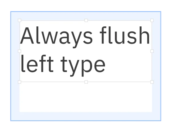
Right: type set against the padding
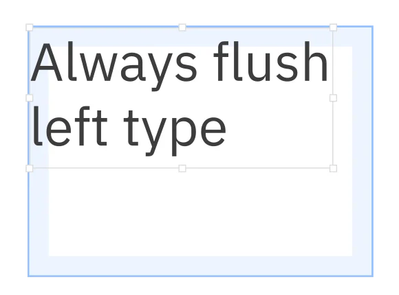
Wrong: type set on the padding
The rule beside them reads “Always place type against the padding”, with its counterpart, “Never place type on the padding”. Diagrams from IBM's Carbon Design System.
Imagery direction
Imagery rules say what pictures show and what they must not pretend to show. For Extropic, a chip company, the guidance an agent received for one task said to “use the supplied product and technical visuals rather than generic computing imagery, and preserve what the source image actually depicts”.
Iconography
Icons need their own small system, or each designer draws a slightly different set. Carbon puts its icons on 16px artboards, allows 20, 24 and 32px where larger ones are needed, and requires that icons are “always a solid, monochromatic color” with the same 4.5:1 contrast as text.
Motion
Motion is the part most often missing. Carbon splits it into two modes: productive motion, which is “subtle and out of the way” for task-focused moments, and expressive motion for significant moments such as opening a new page. Its rule for the second is to “reserve expressive motion for occasional, important moments”.
One system, many formats: Eager
Eager is a UK juice brand that sells its juices in cartons. The cartons are a visual identity system in miniature: each flavour gets its own solid colour, the fruit's name runs up the carton in a large serif, a vertical EAGER wordmark sits at the top, a small descriptor sits below, and every carton has a white screw cap. Seven flavours, one system:
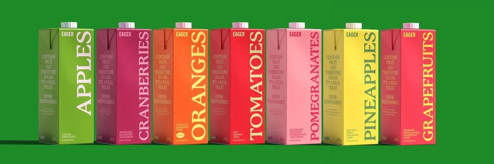
Eager's carton range, from the brand's files
The rules beyond the carton are short. The core palette is yellow #FFF064, charcoal #3A3A3A and white, and the website adds black and a green, #1D8927; we checked these against eagerdrinks.com. P22 Mackinac Pro, a serif, does both the display and the text. The imagery is either crisp studio shots of the cartons or warm, natural kitchen scenes, always product first.
In a published Rainbrand example, Claude was asked to invent an eighth flavour, blackcurrant, and make its launch campaign: a landing page, an email, a five-slide Instagram carousel, a 12-second reel and a 20-second film. Rainbrand keeps a brand's guidance and files as shared context for agents. It returns what one task needs as a Brief, and checks an image of a finished asset against the brand with a Review.
The rule, the exception and the mistake
The standing rule is the palette above: yellow, charcoal and white, with black and green on the website. Purple isn't in it. The task needed an exception, a purple carton for the new flavour. Claude's Brief described the carton system (“bold serif fruit names, vertical EAGER treatment, small descriptor text, colour-led cartons and white screw caps”) and drew a line around the new colour:
Purple and lilac are not documented Eager brand colours: use them only as the task’s hypothetical flavour direction, not as a revision to the brand palette.
The first landing page crossed that line. The campaign line was “Now in purple.”, and Claude set the last word in the carton's purple:
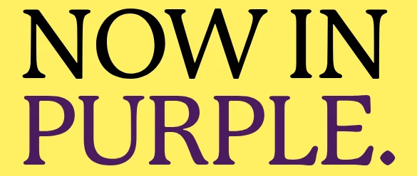
Round one: the headline uses the carton's purple
The Review failed the colour check: “The yellow background and black elements match brand colors, but the headline text uses unapproved purple instead of black or charcoal.” Claude set the whole headline in black and asked for another Review, which passed it and noted that the carton's purple “reflects product packaging”:
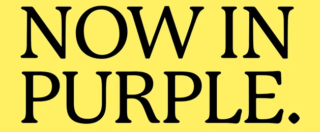
Round two: the headline in black, which passed
That is the line a system draws. The exception applied to the carton, the thing the carton system lets vary, and stopped at the type, which it doesn't. Here is the corrected concept across three formats:
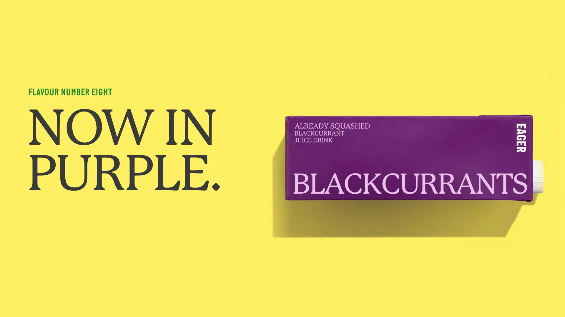
Launch film, 1920 × 1080
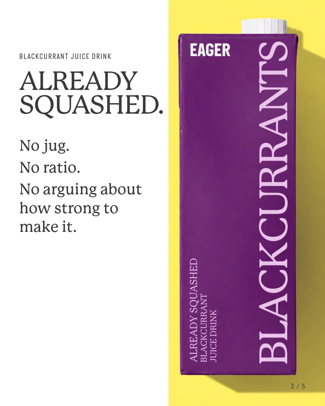
Instagram carousel, slide 3
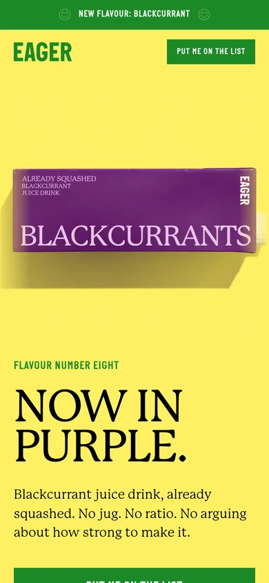
Landing page on a phone
Each format kept the same decisions: the yellow ground, the dark serif headline, the carton as the hero, and the real wordmark file in the layouts. Nothing in Eager's brand described a landing page, a film or a carousel slide, yet its colour, type and packaging rules carried into all three.
What Eager's brand doesn't contain is just as telling. It has no grid and no motion rules, so the page layout and the film's movement were new decisions for this concept, made inside the colour, type and packaging rules. A brand that wants every film to move the same way has to write that down.
Famous visual identity systems
The best-known systems are the ones that were written down in a manual and survived contact with many makers.
- New York City Transit Authority, 1970. Massimo Vignelli and Bob Noorda of Unimark International designed the subway's Graphics Standards Manual. Designers still study it, and after a 2014 Kickstarter campaign it was reissued as a book.
- IBM, today. IBM publishes its design language and the open-source Carbon Design System for anyone to read: the grid, type sets, colour, icons and motion rules quoted above, with the reasoning behind each. It is one of the few corporate systems you can study whole.
- Duolingo, 2013. When Duolingo redrew its owl, Duo, the aim was “a single consistent design that makes Duolingo look the same regardless of where you use it”. That sentence is a good test for any system.
- Bosch. Frontify's visual identity guide reports that Bosch had 17 separate sets of brand guidelines and 60 variations of its home icon in use. That is what happens when there are rules, but no single system.
Visual identity system, brand guidelines or design system?
The three overlap and get used interchangeably. They are different things:
| Term | What it covers | Who mostly uses it |
|---|---|---|
| Visual identity system | The visual rules for the brand, across print, screen, packaging and motion | Designers, agencies, marketing teams |
| Brand guidelines | The document that records the identity, including voice and messaging | Everyone who makes brand assets |
| Design system | Components, tokens and code for a product's interface | Product designers and engineers |
A design system can implement a visual identity system in a product, but its scope is the product, so billboards and cartons sit outside it. All three sit inside a wider brand system. HubSpot's guide describes a visual identity system as “a guide that demonstrates the full visual experience of a brand”, which is the scope to aim for.
How to design a visual identity system
The design itself belongs to designers. What turns their designs into a system is mostly structure, and it follows the same order every time:
- Start from the identity, not the logo. The brand identity, its positioning and personality, decides what the visuals have to express.
- List the formats it must survive. App icon, website, slide, social story, packaging, signage, video. Design the elements against the smallest and the largest, not only the middle.
- Design the core elements. Logo versions, palette, typefaces, imagery direction and any graphic devices.
- Define the relationships. Colour roles and proportions, the type scale, the grid, spacing and how things move. This is the step that makes it a system.
- Write the rules with right and wrong examples, and ship the files. Then hand it to someone who wasn't involved, or to an agent, and have them make three formats. Every question they ask is a missing rule.
Make the system usable by an agent
A system written for designers often leans on shared understanding: a mood board, a few hero examples, a designer down the hall to ask. An AI agent has none of that. It applies what it is given to the format in front of it. Four things make a visual identity system work for agents:
- Write rules as roles, not just examples. “Charcoal for headlines and body, yellow for grounds, green for buttons” lets an agent build a format you never showed it. A gallery of finished posters doesn't.
- Say what may change and what may not. Eager's cartons change colour per flavour; its palette and typeface don't. Without that line, an agent can't tell a flexible part from a fixed one.
- Supply the files. The real logo SVG, the font files and the approved photographs, so the agent places them rather than imitating them. Brand assets lists what each file needs to be.
- Fill the gaps you can see. If your brand has no layout or motion rules, every agent will invent its own. Write down the few that matter: margins, how the logo animates in, how long a title holds.
A quick test: ask an agent to make one format your brand has never produced, using only your written system, and to list every decision it had to guess. The list is your to-do list.
Using only our visual identity guidelines and the files supplied with them, design a 1080 × 1920 story frame announcing an event. Don't invent rules. When you make a decision the guidelines don't cover, such as layout, spacing, motion, colour roles or which logo version to use, list it with the reason you chose what you did. Then tell me which of those decisions should become written rules.FAQ
Does a small brand need a visual identity system?
Yes, a small one. A one-page set of rules covering the logo versions, colour roles, type hierarchy and what photographs should show is enough to keep a few people, an agency and an AI tool making assets that look like one brand.
How do you keep a visual identity system consistent across AI tools?
Give every tool the same current rules and files for each task, rather than a copy saved in each one, and check what comes back before it ships. When a rule changes, have each tool fetch it again; copies saved earlier don't update themselves. Brand guidelines vs brand context explains how one system becomes the right instructions for each task.
More in Images and design
All 10 Images and design articles10 min read
Creative brief template: free download with design and campaign brief versions
A free creative brief template in Word and Markdown, with design and campaign brief versions, a completed example from a real concept with its unknowns marked, what to write in each section, and the gaps real briefs leave open.
11 min read
How to keep AI ads on-brand across markets
We made one ad for two markets, the US and Japan, and recorded every decision. Keep the photo, logo and layout identical, take each market's words and prices from its own page, choose a font for each script, and check every version before someone in the market approves it.
11 min read
How can non-designers make on-brand assets without a designer?
Marketers, founders and salespeople can make everyday assets on-brand if a template holds the design and they change only the words and photo. A complete example, from a failed AI-made post to an editable template and two exported versions, with what the brand settled, what the template settled and what the checks found.