By Siddharth Borderwala
Published
14 min read
What is brand identity? The visual, verbal and behavioural parts, with examples
Brand identity is how a company deliberately presents itself: how it looks, how it speaks and how it behaves. Real examples from Patagonia, IKEA, LEGO, Aesop and Headspace, how identity differs from image, and a concept email made from one written identity.
TL;DR
Brand identity is everything a company deliberately puts forward so people recognise it and know what it stands for: how it looks, how it speaks and how it behaves. Brand image is what people actually take away. A useful identity is written down as rules and examples someone else can apply, which now includes the AI agents making a brand's assets.
What brand identity means
Brand identity is the part of a brand the company controls. It covers the name, logo, colours, type and photography, the way the brand writes and talks, and what it does in public: the products it makes, the services and policies it offers, and what it will and won't claim. Harvard Business School professor Jill Avery puts it in one line: “Brand identity captures the meaning intent of the firm” (HBS Online).
Definitions usually lead with the logo and palette, because they are the easiest parts to show. The HBS guide starts earlier, with the customer value proposition, which it says guides product development and how resources are spent, and with research into what customers value and what frustrates them. The visual identity comes after those decisions and expresses them.
Identity, image and brand
Three words get used for the same thing, and they aren't the same:
| Term | What it is | Who controls it |
|---|---|---|
| Brand identity | What the company decides to present: look, voice, behaviour | The company |
| Brand image | What people actually believe about the brand | The audience, from what they see |
| Brand | The whole relationship between the two, built up over years | Neither, entirely |
Avery's point, in the same HBS piece, is that the message managers intend and the one customers receive can differ. Identity is the only part you can write down. Image is what you measure, through surveys, reviews and reputation rankings, to find out whether the identity is landing.
Patagonia, the outdoor clothing company, is a clear case of the two lining up. Its identity is unusually explicit, and in 2023 it ranked first in the Axios Harris Poll 100, which asked more than 16,000 people to rate the reputations of the companies most on Americans' minds (CNBC, May 31, 2023). The rest of this article uses Patagonia to show each part of an identity, then an email made from it.
The three layers of a brand identity
| Layer | What it covers | At Patagonia |
|---|---|---|
| Visual | Logo, colour, type, photography, layout, packaging | A lowercase wordmark kept off busy photography; the Ridgeway Sans typeface on its websites |
| Verbal | Name, purpose line, voice, vocabulary, messaging | “We’re in business to save our home planet”; a direct, candid voice |
| Behavioural | What the company makes, offers, does and claims where people see it | Repair and used gear; the 2011 “Don’t Buy This Jacket” ad; the 2022 change of ownership |
Each layer has three sources worth keeping apart: what the company officially says, what it visibly does, and the rules someone else derives from both. The rules quoted below come from our brand guidelines library, whose pages are built from each brand's public material and checked by a named reviewer. They are our interpretation, not the brands' own guides.
Visual identity
The visual layer is what people recognise from across a room: the mark, the colours, the typeface, the kind of photographs. It has the most rules and the most files, and the rules that make those parts work together form a visual identity system. From Patagonia's public material, our Patagonia page derives two short rules for the mark: use the lowercase wordmark unaltered, and don't set it over busy photography.
Verbal identity
The verbal layer is how the brand sounds. Patagonia changed its purpose in 2018 to one sentence, “We’re in business to save our home planet”, and its copy is candid about its own costs. Its 2011 explanation of the ad below says: “Everything we make takes something from the planet we can’t give back.”
A rule derived from lines like that is a decision, not an adjective. Our library page puts it as “Favor candid statements over polished corporate generalities”, which tells a writer what to cut. A personality list does less: Jennifer Aaker's 1997 study grouped brand personality into five dimensions (sincerity, excitement, competence, sophistication and ruggedness), which helps to position a brand but doesn't tell anyone how to write a subject line.
Behavioural identity
The behavioural layer is what the company does that people can see. On Black Friday 2011, Patagonia ran a full-page ad in The New York Times asking readers to think before they bought, because “everyone needs to consume less”:
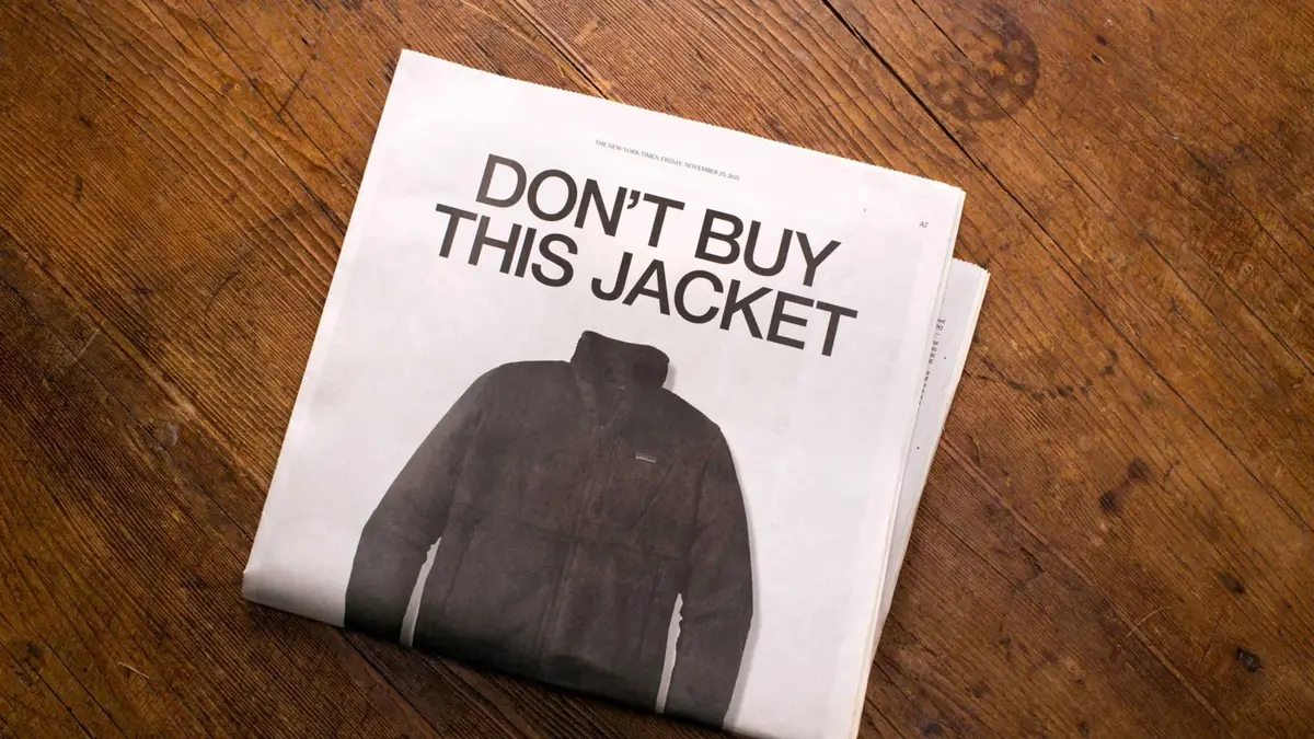
Patagonia's 2011 ad, from Patagonia's story “Don’t Buy This Jacket, Black Friday and the New York Times”
In September 2022, founder Yvon Chouinard announced a change of ownership under the headline “Earth is now our only shareholder”. All the voting stock went to a trust set up to protect the company's values and all the non-voting stock to a nonprofit, the Holdfast Collective. Each year's profit after reinvestment would be paid out as a dividend to help fight the environmental crisis (Patagonia).
Here is how those statements and actions turn into rules for someone writing about the brand:
| What Patagonia says | What it does | Rainbrand's rule, our interpretation |
|---|---|---|
| “Earth is now our only shareholder” (2022) | Gave its voting shares to a trust and its non-voting shares to a nonprofit; still sells clothing | “Don’t present Patagonia as a nonprofit; it continues to operate as a for-profit business.” |
| “Everything we make takes something from the planet we can’t give back” (2011) | Ran a Black Friday ad against buying, and points customers to repair and used gear | Encourage repair and reuse, but don't suggest any one action makes a product impact-free |
| “While we’re doing our best to address the environmental crisis, it’s not enough” (2022) | Committed each year's profit after reinvestment to fighting the crisis | “Don’t make environmental promises sound like finished work” |
The third column is where a new writer, or an agent, gets things wrong. A confident line calling Patagonia a nonprofit would be easy to write after reading the 2022 headline, and the company would never sign it.
Brand identity examples
Patagonia shows all three layers at once. Most brands are known for one or two, and the useful question about any identity is which layer carries the recognition. Four more, each shown from the brand's own pages:
IKEA: a vision, and a positioning that sets the price
IKEA's vision is a purpose, broad on purpose: “To create a better everyday life for the many people.” It doesn't say what IKEA sells or how it differs. The positioning sits next to it on the same page, as IKEA's business idea: “to offer a wide range of well-designed, functional home furnishing products at prices so low that as many people as possible will be able to afford them.” That names a category, an audience and a difference.
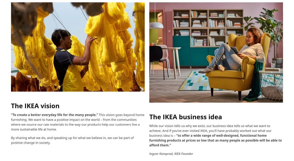
IKEA's vision and business idea, from IKEA's “The IKEA vision and values” page, captured November 16, 2026
The business idea is behaviour as much as words. One of IKEA's listed values is cost-consciousness, because “low prices are impossible without low costs”. Our IKEA page turns the business idea into a test for every headline: never make home solutions feel “exclusive, impractical, or out of reach”.
LEGO: a quality motto that became behaviour
LEGO's best-known line isn't a tagline. “Only the best is good enough” is the company motto, and LEGO's history says quality has been a key value since Ole Kirk Kristiansen set up the business in 1932. The same page shows what that meant in practice: making its own moulds, and a quality control department of 13 people set up in 1963.
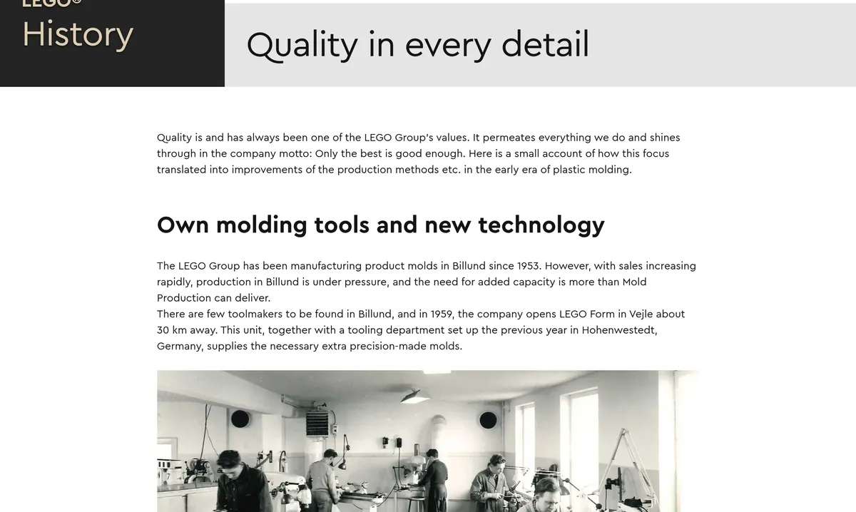
From LEGO's history page “Quality in every detail”, captured November 16, 2026
The motto is the behavioural layer in five words: a promise about how the product is made, which the marketing then has to live up to. The verbal layer sits on top, warm and inviting, and the motto keeps that warmth honest, because a brand that promises only the best can't make claims its bricks don't support.
Aesop: a voice that sounds like nobody else's
Aesop, the skin care company, is carried by words more than any other brand here. On its product page, the Unforeseen Aer fragrance is “A fragrant fable of fresh, aromatic, mineral character, taking the mind to rugged, wind-blown heights.” The same page offers a 2 mL sample with every Eau de Parfum order, so customers can return the unopened bottle if the scent “does not agree with your olfactory sensibilities”. That is a policy written in the brand's voice.
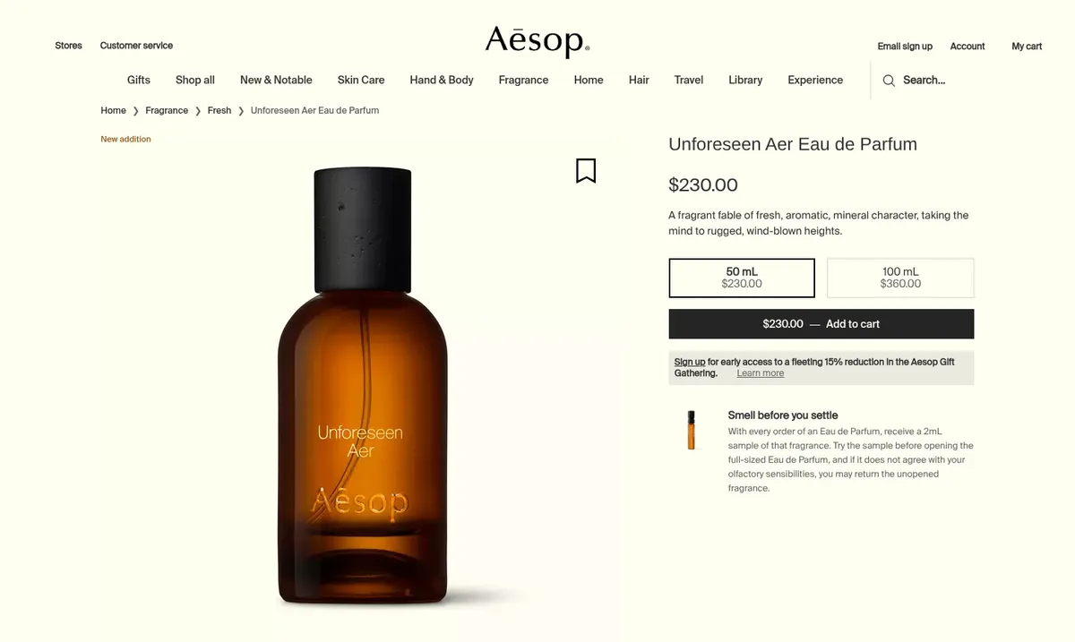
Aesop's Unforeseen Aer product page, captured November 16, 2026
Copy like this is the hardest layer to hand to someone new, or to an agent, because adjectives such as “literary” don't say what to write. Our Aesop page sets the limit: “Don’t let poetic copy obscure useful product information.” The fable comes first, and the character of the scent and the sample policy are still there in plain terms.
Headspace: one shape that carries the brand
Headspace, the meditation and mental health app, has one of the simplest marks in the library: an orange dot beside the lowercase wordmark. On its home page the same dot becomes a character with a closed-eyed smile, here carrying a seasonal offer.
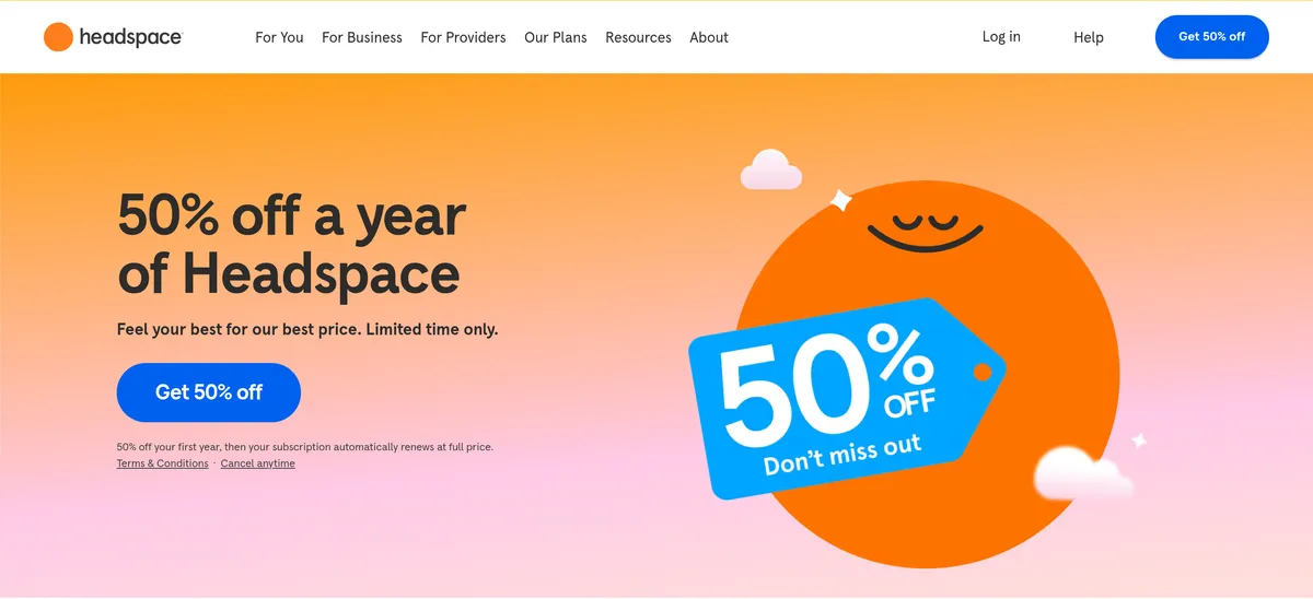
Headspace's home page, captured November 16, 2026
A single shape in a single colour works at app-icon size, as a character and on a banner. The behavioural layer is stricter, because Headspace works in health: our Headspace page says not to “frame meditation as a cure-all” or promise a guaranteed outcome. A simple visual identity can sit on top of strict rules about what the brand may claim.
Corporate brand identity
Corporate brand identity is the identity of the company as a whole, rather than of one product. Wikipedia's corporate identity article defines it as “the manner in which a corporation, firm or business enterprise presents itself”, mostly through its visual identity but also through product design, advertising and public relations. Its audience is wider than customers: employees and recruits, investors, partners and regulators.
Sometimes the corporate and product identities are the same. Patagonia's company and its clothing share one name, one voice and one set of commitments, so its corporate identity is its brand identity. Sometimes they are deliberately different. When Google reorganised under a new parent company in 2015, the founders' letter described Alphabet as “mostly a collection of companies” and said, “we are not intending for this to be a big consumer brand with related products”. Alphabet's corporate identity is for shareholders, at abc.xyz; Google keeps the consumer identity.
The practical question is which identity an asset should carry. A recruiting page, an investor deck and a product ad from the same company can each need a different one, and the rules should say which.
One email, made from a written identity
An identity only works if everyone who makes an asset can apply it, and more of those assets are now made by AI agents. An agent doesn't absorb a brand over months. It works from what its task gives it.
Rainbrand keeps a brand's identity, guidance and files as shared context that agents request for each task. The answer is a Brief: the guidance and files from the brand that the task needs. On November 15, 2026, we requested one from the Patagonia brand behind our library page, for a concept: a Black Friday email asking customers to repair or buy used before buying new.
The Brief returned the wordmark as an SVG file, the Ridgeway Sans font file and a photograph of hands repairing a Patagonia jacket. It said what the sources don't cover: no Black Friday rules or sale mechanics, so the email shouldn't imply a sale or an existing campaign. And it carried the behavioural layer as rules for the copy:
Care, repair, buying used, and trading in for credit are described as ways to keep products in play. It is appropriate to encourage those actions, but don’t suggest that any one customer action makes a product or Patagonia’s business impact-free.
We wrote the email to that rule, built it in HTML with the Brief's files, and checked each capture with a Review, which compares an image of an asset with the brand and returns a verdict and a reason for each check.
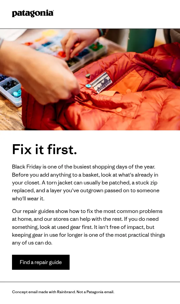
Concept repair-and-reuse email, final round
The sentence doing the identity's work is in the second paragraph: used gear “isn't free of impact, but keeping gear in use for longer is one of the most practical things any of us can do.” It asks for less buying without promising that any purchase is harmless. Four rounds got there:
| Round | What the Review found | What we changed |
|---|---|---|
| 1 | Colour failed: the footer divider was a grey outside the palette. Copy failed: we had shown the subject line in the image, with a label and changed capitals. | Made the divider and footer black. Moved the subject line, “Before you buy anything this Friday”, out of the image. |
| 2 | Typography failed: the button lettering didn't match the body style. | Set the button in Ridgeway Sans Light, like the body. |
| 3 | Copy passed, quoting Patagonia's guidance to be candid about environmental impact. Colour, typography and logo were uncertain. | One change of our own, below. |
| 4 | Copy passed again; colour, typography and logo stayed uncertain. | Nothing. |
The change after round three was a fact the Review had no way to judge. The first paragraph opened “Black Friday is the busiest shopping day of the year”, which we couldn't support, so it now says “one of the busiest”. A Review checks an asset against the brand's guidance; whether a claim is true still needs someone with a source.
For a whole brand turning into different context for different tasks, see brand guidelines vs brand context.
How to create a brand identity
A brand identity is finished when someone who has never met your team, or an agent, can make an asset from it and you would sign the result. Getting there takes six steps.
- Start from the audience and the positioning. Find out what customers value and what frustrates them, then write down who the brand is for, what it offers them and how it differs from the alternatives. IKEA's business idea does all three in one sentence. Its vision, a purpose, sits above it.
- Find out what people already recognise. For an existing brand, ask customers what they associate with you and look at what competitors use. Keep what is already distinctive, because recognition takes years to build. Brand assets covers how researchers test which cues people actually link to a brand.
- Decide each layer. Visual: logo, colour, type, imagery. Verbal: name, purpose line, voice, words you use and avoid. Behavioural: what the company makes and offers, what it visibly does, and what it will and won't claim. The third is the easiest to skip and the most expensive to leave out.
- Design and write it. This is where a designer, an agency or an in-house team does the creative work: the marks, the type, the photography direction, the voice. Brand elements covers how to choose each element so it lasts.
- Turn the decisions into rules with examples. An adjective becomes a decision someone can apply, and each rule gets one right and one wrong example. Use the worksheet below.
- Test it, then keep it current. Hand the rules and files to someone new and to an AI agent, ask each for three assets in different formats, and note every decision they had to guess. Fix those gaps, name an owner, and record each change with its date.
The worksheet for step 5:
VISUAL
Logo files and when to use each:
Colours, with values and each one's job:
Typefaces, with font files and weights:
Imagery: two right examples, one wrong:

VERBAL
Purpose or positioning line:
Voice, as decisions, not adjectives:
Words you use; words you never use:
Two approved pieces of copy:

BEHAVIOURAL
What the company visibly does:
Claims you can support, with sources:
Claims you must never make, and why:
Topics that need a named sign-off:

CORPORATE
Which identity each kind of asset
carries (company, product, campaign):
The behavioural section is usually the emptiest. Fill it from what the company actually does, with a source for each claim, as the Patagonia table above does. Brand voice examples has published guides to borrow from for the verbal section, and brand management covers who keeps all of it current.
FAQ
What is the difference between brand identity and brand personality?
Brand personality describes the human traits people associate with a brand, such as sincerity or ruggedness in Jennifer Aaker's 1997 framework. It is an input to the verbal and visual identity. The identity is the set of concrete decisions, such as the voice rules and the photography, that express that personality.
Can a brand identity change?
Yes, and good ones change deliberately. Patagonia rewrote its purpose in 2018 and changed its ownership in 2022 without changing its name or logo. When an identity changes, every place it is recorded has to change too, including guidelines, templates and the context AI agents use.
Who is responsible for brand identity?
Usually a brand or marketing lead owns it, with designers and writers maintaining the visual and verbal rules. The behavioural layer needs the people who decide what the company does and claims, often including legal or leadership. In a startup, the founder is often all of these.
How do you know if a brand identity is working?
Measure the brand image it produces: whether people recognise the brand, what they associate with it, and whether those associations match what you intended. Surveys, reviews and reputation rankings show the outside view. Inside, track which corrections come up again and again before assets ship, then find the cause: a rule that is unclear, a rule that is missing, a file people can't find, or a deadline that skips the check.
More in Brand guidelines
All 18 Brand guidelines articles18 min read
Brand guidelines examples: 12 real brand books and what to copy from each
Twelve brand guidelines you can open today, from Mastercard’s logo rules to NASA’s 1976 standards manual, with the exact rule worth copying from each, which ones an AI agent can read, and what it took to correct an agent’s version of Starbucks.
10 min read
Branding kit checklist: what to include, file formats and real examples
What a branding kit should contain, from logo files and colour values to fonts, templates and rights; what to agree with your designer; what real companies’ kits hold; and a bounded web sample kit, with its index, a template and an asset made from it.
11 min read
Logo usage guidelines: what to include and how to write them
Logo usage guidelines say which logo goes where, how much space it needs, how small it can go, which colours and backgrounds it allows and what never to do. See how Amazon and Strava write each rule, how AI tools get logos wrong, and a template to download.