By Siddharth Borderwala
Published
11 min read
Logo usage guidelines: what to include and how to write them
Logo usage guidelines say which logo goes where, how much space it needs, how small it can go, which colours and backgrounds it allows and what never to do. See how Amazon and Strava write each rule, how AI tools get logos wrong, and a template to download.
TL;DR
Logo usage guidelines tell anyone placing your logo which version to use, how much clear space to leave, how small it can go, which colours and backgrounds are allowed, what never to do, how it sits beside partners' logos and where to get the files. Write each rule as a measurement or a named file, and give AI tools the real logo file: image models redraw logos.
Logos rarely break in dramatic ways. They get stretched to fill a banner, recoloured to match a slide, shrunk until the details close up, crowded by a headline or put beside a partner's logo at twice the size. Logo usage guidelines exist to stop those small changes, and they're usually the most precise part of a brand's guidelines, because a logo is the one element that should look the same every time.
They matter more now that AI tools place logos too. An agent building a slide or a web page can drop in the real file if your guidelines link it. An image model asked to include your logo will draw its own version from what it has seen, and the details drift.
What to include
Most logo guidelines cover the same seven things. The best ones turn each into a rule someone can check, often with a diagram:
| Section | What it settles | A guide that does it well |
|---|---|---|
| Versions and lockups | Which logos exist and when each one is used | Amazon Echo |
| Clear space | How much empty space surrounds the logo, measured from the logo | Amazon Echo |
| Minimum size | How small it can go on screen and in print before details are lost | Amazon Echo |
| Colours and backgrounds | Which colour version goes on which background | Amazon Echo, Strava |
| Misuse | The changes that are never allowed, shown as examples | Amazon Echo |
| Partners and co-branding | How it sits beside other logos, and who may use it | Strava |
| Files | Which formats exist and the one place to get them | Strava, LinkedIn |
The examples below come from two public guides. Amazon's Echo logo guidelines, on its Alexa developer site, cover the logos for its Echo smart speakers. Strava, the app runners and cyclists use to record activities, publishes API brand guidelines, last revised on September 29, 2025, for developers whose apps show Strava's logos.
Versions and lockups
List every version with its file and say when each one is used. Amazon's guidelines define three Echo logos for its own creative: the Smile logo, with the arrow-shaped smile under "echo"; the No-Smile logo; and the Amazon Echo lockup, which pairs the Amazon logo with "echo". The page then lists the situations each version is for.
A lockup is a fixed arrangement of logo parts, such as a symbol beside a wordmark. Treat each lockup as its own file, not as instructions for assembling one. Amazon's guidelines also cover adding a product name to the logo: its height must match the logo's x-height, the height of a lowercase letter, with spacing that is "consistent throughout."
Clear space
Clear space is the empty area around the logo that nothing else may enter. Measure it from the logo itself, so it scales with the logo. Amazon uses one letter for all three Echo logos: "The clear space is measured by the x-height of the letter 'e.'"
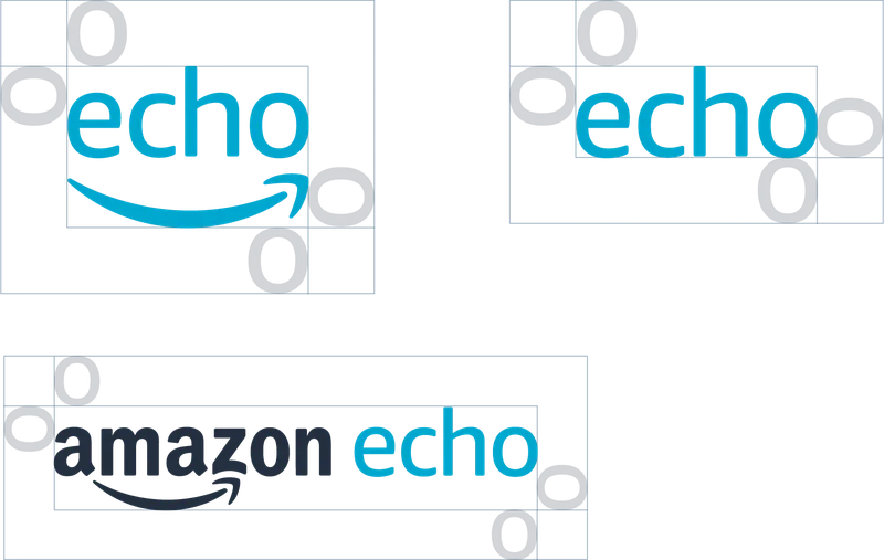
Clear space for Amazon's three Echo logos, from its logo guidelines
The rule is a minimum, and Amazon says so: "Whenever possible, use the maximum amount of clear space the placement in layout will allow." That one sentence settles a common argument between a designer who wants room and a layout that wants the space for something else.
Minimum size
Give the smallest size in both screen and print units, and say what you're measuring. Amazon's is unambiguous: "The Amazon Echo logo should not appear smaller than 0.1875 inches, or 14 pixels, from the baseline to ascender height." Measuring the letters rather than the whole logo means the rule works whichever version is used.
Find your own by shrinking the logo until a detail fills in or a thin line disappears, then add a margin. If the logo has a version with fewer details, such as a symbol without the wordmark, say that it's the one to use below the minimum.
Colours and backgrounds
Say which colour version goes on which background, rather than listing the versions and leaving people to choose. Amazon's rule is conditional: if the logo can't sit on a white or light background, "the logo may appear reversed out of an Echo Blue or Squid Ink background", and its secondary colour versions "are only to be used when there is a conflict using the primary color variations."
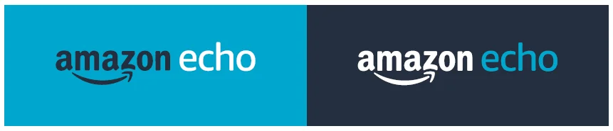
The Echo lockup on Echo Blue and on Squid Ink
Strava offers its partner logos in three colours, orange, white and black, which covers light, dark and one-colour printing. Whatever your set, name the background each one is for, and add the hex values so the rule can be checked.
Misuse
A "don't" section prevents more mistakes than any amount of explanation, because people recognise a mistake faster than they read a rule. Amazon's list for the Echo logo is a good model, and short:
- Don't alter the logo colours.
- Don't reposition or rescale the logo components.
- Don't add any other text to the logo, or add effects.
- Don't squeeze or stretch the logo.
- Don't place it on a background without significant contrast, or on unapproved colours.
- Don't place it on a photo without significant negative space.
- Don't place it within running text.
Show each one as a picture of the mistake, crossed out. Keep the list to mistakes people actually make; an exhaustive list of hypothetical ones gets skimmed.
Partners and co-branding
Say how your logo sits beside someone else's, and what others may do with yours. Strava's rules for developers are clear on both. Its logos "can appear near, but must be completely separate and apart from (and should not appear more prominently than) the name/logo of your application", and developers must "never use any part of a Strava logo as the icon for your application." When an app links back to Strava data, the link text is "View on Strava".
Amazon's guidelines set limits on third parties too: "We do not generally allow third parties to use our logos directly on their hardware," and approval involves PR, business leadership, legal and trademarks, "several weeks prior to any logos being printed on physical hardware."
Files and where to get them
Offer the logo as a vector file for screens and scaling (SVG), a PNG with a transparent background for tools that don't accept SVG, and a print format (EPS or PDF), the split Vistaprint recommends too. Strava provides its partner logos in EPS, SVG and PNG, in horizontal and stacked versions.
Then name one place to get them, such as the brand's branding kit. LinkedIn's brand page puts it bluntly: "Any logos or images found elsewhere on the web are not approved for use." A logo copied from an image search may be an old version, a fan redraw or a screenshot with the wrong colours.
How AI tools get logos wrong
AI tools handle logos in two ways, and the guidelines need to cover both.
Agents that build slides, documents, web pages or code can place an exact file. If your guidelines link the SVG and say which version goes on which background, an agent can follow them as a designer would. If the guidelines only show a picture of the logo inside a PDF, the agent has to find a file elsewhere, and may take one from an image search, the source LinkedIn warns against.
Image models are different. Asked for an image with your logo in it, they draw the logo, and small things change: a letter's shape, a symbol's proportions, a colour, a registered mark. The fix is to generate the image without the logo and place the real file afterwards; applying brand guidelines to AI images shows a wordmark that went wrong and the corrected version.
Then check what comes back. Rainbrand maintains a brand's guidelines and files as context that AI agents call while they work, and its Review checks an image of an asset against the brand, with a verdict and a reason for each check. It doesn't change the asset; the fix is yours or your agent's.
A crowded logo
Real logo mistakes are usually smaller than a stretched or recoloured mark: a headline set a little too close, for example. On November 16, 2026, an Amazon Echo brand was added to Rainbrand from Amazon's Echo logo guidelines page and the official files in Amazon's Echo logo download. Its logo guidance kept Amazon's rule word for word: "The clear space is measured by the x-height of the letter 'e.'"
A 1200 by 628 web banner concept was then made for this article with the official Amazon Echo lockup, a headline and the trademark line Amazon asks for. At the size used, the "e" in "echo" is 41 pixels tall, so the rule needs 41 pixels of empty space under the logo. The headline started 9 pixels below it:
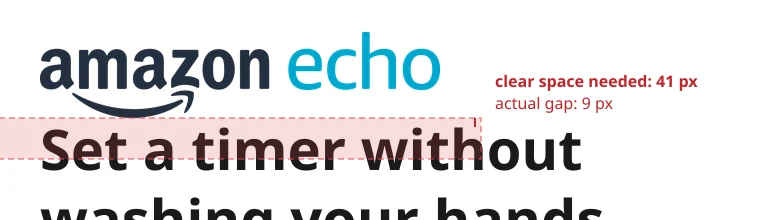
The clear space the rule needs, against the actual gap
The Review's logo check failed it: "The official Amazon Echo lockup is unaltered and legible, but the headline crowds its required clear space. Move the headline farther below the logo." Its evidence kept the two questions apart. The artwork itself matched the official logo in shape, proportions, angle and colour, so the failure was placement alone:
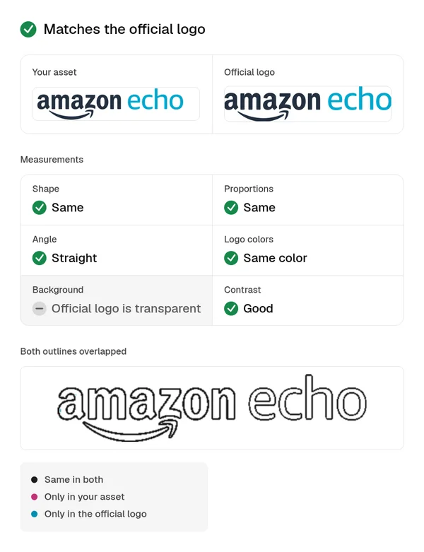
Review evidence for the logo artwork
Moving the headline down to 61 pixels below the logo, and changing nothing else, passed: "The Amazon Echo lockup matches the official artwork and colors, remains clear on white, and has sufficient space and size. Required attribution is present."
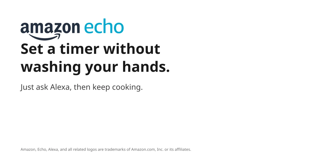
9 px gap: logo fail
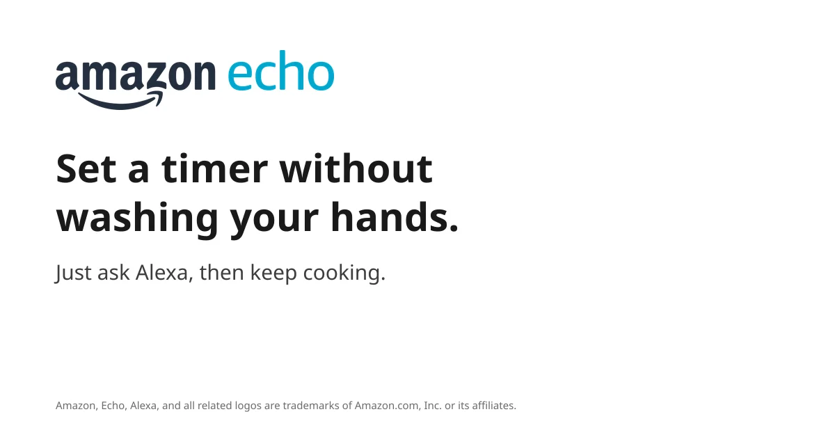
61 px gap: logo pass
A stretched logo
An earlier test, on November 15, 2026, used Strava's wordmark on a plain slide: once as supplied, and once stretched 45% wider and recoloured blue, as a careless edit might. Both were reviewed against Strava's brand, built from strava.com for Rainbrand's brand guidelines library.
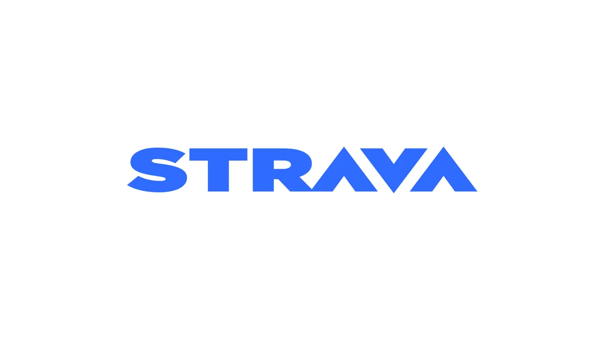
Stretched and recoloured: colour fail, logo uncertain
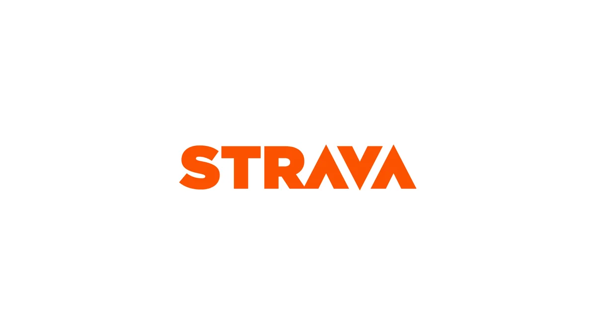
As supplied: colour pass, logo pass
For the altered slide, the colour check failed: "The wordmark is blue (#2F6BFF), not Strava Orange (#FC5200); this blue is outside the brand palette." The logo check came back uncertain rather than failed, and its note named the problem: "horizontal stretching prevents confirming its conformity to the original artwork." The slide made from the supplied file passed both, with the logo described as matching "the official artwork, with unchanged proportions."
An uncertain verdict means look at it yourself, and here that takes a second. Both tests were made for this article: the Echo banner has one placement problem, and the Strava slide has two obvious ones at once. Real assets can mix several, so read every check, not just the first failure. How to check AI images against your brand guidelines covers turning each logo rule into a pass or a fail.
The same brand context helps before anything is made. Strava's library page lists three logo versions (the orange wordmark, a white wordmark and the chevron symbol) in six files, an SVG and a PNG of each, with the rule to keep "the orange wordmark on white and light backgrounds, the white wordmark on orange, dark or photographic ones." A Brief, the guidance and files for one task, can hand an agent those files with the rules, so it places the logo rather than drawing it.
A logo section template
Download the logo usage guidelines template, a Markdown file you can paste into your brand guidelines or open in Google Docs. Each part has fields to fill and a line from the Amazon or Strava rules above as an example. Keep a field marked TODO until someone decides it; a guess in a logo rule gets copied into every asset.
These are the fields it asks for:
Owner:              [name, contact]
Last updated:       [YYYY-MM-DD]

VERSIONS
Primary logo:       [files] · [use when]
Secondary lockup:   [files] · [use when]
Symbol only:        [files] · [use when]

CLEAR SPACE
Rule:               [measured from part of the logo]

MINIMUM SIZE
Screen:             [__ px]
Print:              [__ mm]
Measured:           [e.g. wordmark height]
Below the minimum:  [version to use]

COLOURS AND BACKGROUNDS
Full colour:        [#______] on [backgrounds]
Reversed:           [#FFFFFF] on [backgrounds]
One colour:         [#______] for [uses]

NEVER
[stretch, recolour, rearrange, add effects, redraw]

WITH PARTNERS
Size and spacing:   [rule]
Who approves:       [name]

FOR AI TOOLS
Place the logo from the files above.
Never ask an image model to draw it.
Generate images without it; add it in layout.
Check version, colour, proportions, clear space.

FILES
One source:         [link]
FAQ
What's the difference between logo guidelines and brand guidelines?
Logo guidelines cover the logo alone: versions, space, size, colour, misuse and files. Brand guidelines cover the whole brand, including colour, typography, imagery and voice, and usually include the logo rules as one section. What a brand style guide is covers the rest.
Can I put another company's logo on my site or product?
Only within that company's rules. Many publish partner guidelines, such as Strava's for developers, that say which logo files to use, how prominent they may be and what wording goes with them. Never imply that the other company made or endorses your product.
Can AI generate variations of my logo?
Don't let an image model redraw the logo; it will change the details. A designer should make any new version, such as a stacked lockup or a one-colour mark, as a vector file, and add it to the guidelines. AI tools should then place those files exactly as supplied.
How do I put a logo on a photo?
Choose a part of the photo with plenty of empty, even space, and use the version with the most contrast against it. Amazon's guidelines rule out placing the logo "on top of a photo without significant negative space"; if no area is calm enough, place the logo outside the photo instead.
More in Brand guidelines
All 18 Brand guidelines articles18 min read
Brand guidelines examples: 12 real brand books and what to copy from each
Twelve brand guidelines you can open today, from Mastercard’s logo rules to NASA’s 1976 standards manual, with the exact rule worth copying from each, which ones an AI agent can read, and what it took to correct an agent’s version of Starbucks.
10 min read
Branding kit checklist: what to include, file formats and real examples
What a branding kit should contain, from logo files and colour values to fonts, templates and rights; what to agree with your designer; what real companies’ kits hold; and a bounded web sample kit, with its index, a template and an asset made from it.
14 min read
How to make brand guidelines AI-ready
AI-ready brand guidelines give an agent rules it can apply without guessing, the real logo and font files, and the current version. Rewrite each rule without inventing policy, keep the guide's own decisions apart from your suggestions and the questions only the brand owner can answer, then test the rewrite on a real task.