(Brand guidelines) // Travel and transport
FedEx brand
guidelines
FedEx’s logo, colors, fonts, voice, and dos and don’ts, from the Brand Skill Rainbrand built from fedex.com.
Download the Brand Skill
- Website violet#7E29E0
- Logo orange#FF6600
- White#FFFFFF
- Dark gray#333333
About FedEx
FedEx is a global shipping and logistics brand that helps people and businesses move packages, freight, and commerce. Its identity pairs a distinctive wordmark with practical, confident communication about reliable delivery, connected networks, and control over the shipping experience.
FedEx logo
- Wordmark · PNGDownload FedEx wordmark
Use the FedEx wordmark as the primary brand signature. Preserve its lettering, proportions and the negative-space arrow between the E and x.
The white-and-orange wordmark shown here needs a dark background. Keep service, campaign and interface graphics separate from the main identity.
FedEx colors
Website violet
Digital accent
HEXRGBLogo orange
Orange lettering in the wordmark shown
HEXRGBWhite
Inverse wordmark and light backgrounds
HEXRGBDark gray
Website text
HEXRGB
FedEx fonts
FedEx Sans
Headings · 300, Body · 300
Font names only. The Brand Skill download doesn’t include font files.
FedEx’s voice
Write with clarity, confidence, and practical warmth. Put the customer’s need first, make the next step easy to understand, and pair confident promises with accurate scope and useful detail. Favor short headlines and plain-language explanations over jargon; use a lively turn of phrase when it helps a message feel memorable.
- “Our world evolves around you”
- “Connecting the world responsibly & resourcefully”
- “The new power move: getting your package to its destination on time”
- “Your shipping needs are unique, which is why we offer personalized pricing based on how often, much or far you ship”
Dos and don’ts
Do
- Use the FedEx wordmark or standalone mark as the brand signature; keep identity artwork intact.
- Use signature colors as accents and keep digital layouts legible against light backgrounds.
- Lead with a clear benefit, then explain the useful next step in direct, customer-centered language.
- Make claims precise and include relevant limits or conditions when they affect the customer.
- Keep the tone reassuring, capable, and focused on helping customers stay informed and in control.
Don’t
- Don’t distort, redraw, or replace the brand’s own marks with unrelated icons.
- Don’t make a service sound universally available when its coverage, eligibility, or terms are conditional.
- Don’t bury the practical answer under corporate jargon or inflated claims.
FedEx imagery
41 images from fedex.com, in 4 files of the Brand Skill. Each file starts with its guidance, then shows the images it refers to.
Editorial and content imagery
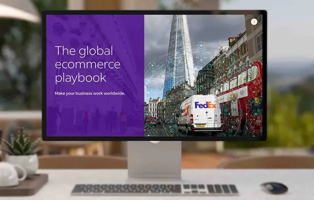
18 imagesUse FedEx editorial imagery to support the story or resource it accompanies. The examples include a history resource, a corporate responsibility report, a digital-solutions blog, and shipping guidance. Keep report covers, article thumbnails, and content graphics in their original editorial roles.

















Graphics and icons
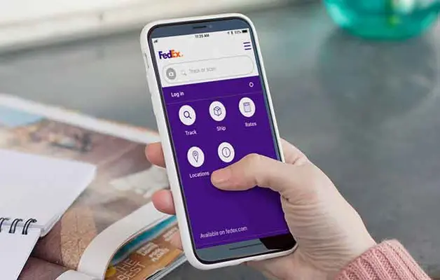
8 imagesUse FedEx graphics and icons to clarify shipping, tracking, analytics, and delivery topics. Keep them subordinate to the message and consistent with the surrounding layout. The website also uses a repeating image asset in service and resource sections; retain it as a visual reference when matching those layouts.








Identity and campaign imagery
6 imagesUse FedEx’s branded backdrops and identity assets where a strong brand signature is appropriate. Campaign images can provide visual references for FedEx-owned promotions; keep their seasonal or promotional context rather than treating them as evergreen product imagery.






Photography
9 imagesFedEx photography shows the people, facilities, aircraft, and package journeys behind the delivery network. Use candid, human-centered scenes for people and community stories; use operational settings and aircraft to communicate scale, movement, and logistics. Preserve the context of each scene rather than presenting a specific story as a universal brand rule.








More from the Brand Skill
Digital interface
FedEx’s website uses a light visual mode with clear spacing, simple rectangular controls, and restrained decoration. Primary buttons are dark with light text; secondary buttons are outlined. Links are underlined. Cards use a subtle border and rounded corners, without a shadow. Keep interface typography in FedEx Sans and make actions easy to scan.
Download FedEx’s Brand Skill
A Brand Skill is a folder of brand guidance written for agents. Give it to Claude, ChatGPT, Cursor or another agent and ask it to follow FedEx’s guidelines. It starts at SKILL.md, which points to the right file for each task.
It has the guidance, 41 images and the logos. The font files belong to Federal Express Corporation, so they’re left out.
fedex-brand-skill/
├ SKILL.md
├ README.md
├ references/
│ ├ dos-and-donts.md
│ ├ colors.md
│ ├ logo.md
│ ├ typography.md
│ ├ voice.md
│ ├ imagery-editorial-and-content.md
│ ├ imagery-graphics-and-icons.md
│ ├ imagery-identity-and-campaigns.md
│ ├ imagery-photography.md
│ └ digital-interface.md
└ assets/
├ images/
└ logos/
Rainbrand’s Brand Agent built this Brand Skill from fedex.com on 3 Nov 2026. It isn’t FedEx’s official guide. Reviewed by Siddharth Borderwala, Founding Engineer at Rainbrand.
FedEx and its logos are trademarks of Federal Express Corporation. Rainbrand isn’t affiliated with or endorsed by Federal Express Corporation.

Make one for
your brand.
Add Rainbrand to your agent and give it your website, brand guide or files. Rainbrand builds a Brand Skill like this one and keeps it up to date.

Open the Rainbrand plugin and add it.
Open Rainbrand plugin (opens in a new tab)Connect your Rainbrand account when asked. It works in ChatGPT and in Codex.
More brand guidelines
See all brands Airbnb brand guidelinesTravel and transport
 Aman brand guidelinesTravel and transport
 Delta Air Lines brand guidelinesTravel and transport

Rainbrand builds and maintains shared brand context for your agents and products.