Claude withRainbrand forFriedhats (opens in a new tab).
 (opens in a new tab)
Step 0: Start with one prompt
Claude chose what to make and wrote this prompt, with the Rainbrand MCP connected.
Use Rainbrand and Friedhats’ brand to help people who have just received a jar of its coffee. Friedhats asks you to rest its light roasts before brewing: at least 2 weeks after roasting for espresso and 3–4 weeks for filter, at their best at 5–6 weeks. Make a round sticker for the jar’s lid that shows the resting window, a phone page that works out when your jar is ready, and a 10-second Instagram Story asking people to bring empty jars back to the FUKU café to be washed, sterilised and reused. Use the real guidance from friedhats.com and label anything new as a concept.
Step 1: Add a brand
Added to Rainbrand from friedhats.com (opens in a new tab). A sample of what Claude could use:
Logo
The boxed FRIEDHATS wordmark
Colours
- #0F172A
- #8B8C8B
- #D0D0D0
- #FFFFFF
- #020817
Typefaces
Aa Bb 123
Ubuntu Mono Bold
Aa Bb 123
Archivo Black
Files 55
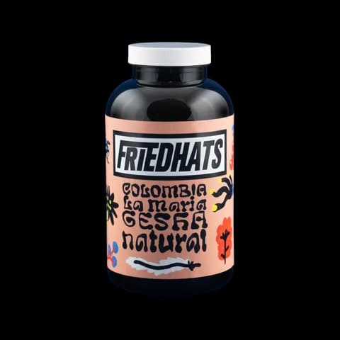
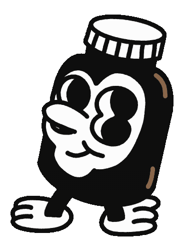
Guidance 10
“Keep the voice conversational, irreverent, and playful.”
Voice, colour, type, identity, characters and four kinds of imagery
Step 2: Ask for Briefs
Claude asked for 2 Briefs first: one for the sticker and phone page, one for the Story.
For the sticker and the phone page
Claude asked for
rainbrand · create_brief
task: “Design two related pieces that help Friedhats customers know when a newly delivered jar of coffee is ready to brew. Friedhats' FAQ asks people to rest its light roasts: at least 2 weeks after roasting for espresso and at least 3–4 weeks for filter, with peak tastiness at 5–6 weeks and freshness slowly fading after 7–8 weeks, because roasted coffee holds CO2 that gets in the way of brewing. Friedhats roasts on Monday, Tuesday and Thursday and ships filter coffee up to 7 days after roasting and espresso up to 10 days. (1) A round die-cut sticker, about 55 mm across, for the white screw-top lid of its black coffee jars: a resting dial for weeks 0–8 marking espresso, filter and peak, a write-in roast date and a short line in Friedhats' voice. (2) A phone web page, 'Is my coffee ready?', where someone enters the roast date, picks filter or espresso, and sees how many days are left, where today falls on the same week 0–8 scale, and an option to add a calendar reminder. It ends by asking people to return empty jars to the FUKU café (Bos en Lommerweg 136, Amsterdam), where jars are washed, sterilised and reused. Both are concepts, not existing Friedhats products. Use the brand's logo, characters, type and website style (black outlines, dot grid, off-white).”
Rainbrand sent backin 33 s
Guidance
Brand context for the two proposed concepts
- Identity
- “prefer the supplied wordmark or FH mark where an identity mark is needed, and treat character artwork as character artwork.” The brand’s primary-logo slot holds the peeking Pop Looky character.
- Filter window
- “Do not silently invent whether that countdown uses 3 or 4 weeks.”
- Small and mobile
- “Keep practical instructions easy to read at the small sticker size and on mobile.”
- Also
- Colour, type, voice, the square-grid pattern, facts it couldn’t verify
Files
8

Ubuntu Mono Bold
Archivo Black
A specimen of each Google font
For the jar-return Story
Claude asked for
rainbrand · create_brief
task: “Make a 10-second, 9:16 Instagram Story animation asking Friedhats customers to bring their empty coffee jars back. Friedhats sells coffee in rigid black jars with white screw-top lids and a different label for each origin. Its FAQ says returned jars are washed, sterilised and reused as specialty coffee packaging; people can drop them at the FUKU café, Bos en Lommerweg 136 in Amsterdam, and customers in the Netherlands with more than 12 jars can ask for a return shipping label. Animate the brand's own characters and product photos rather than drawing new ones: an empty jar character heading back to FUKU, the real labelled jars, and an end card with the logo and 'More gratitude, less attitude'. Short on-screen copy in Friedhats' dry, playful voice; no voiceover. This is a concept, not an existing Friedhats campaign.”
Rainbrand sent backin 53 s
Guidance
Friedhats brand context for this concept
- Character
- “The closest supplied character asset for a jar/bottle role is the rubber-hose-style black medicine-jar character with a white cap and gloved feet.”
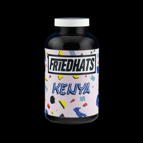
- Product photos
- “Use genuine product photography and preserve its individual label artwork rather than inventing generic packaging or replacing labels.”
- Voice
- “Sustainability should be described as ongoing work, not used as an unsupported slogan.”
- Also
- Identity, colour, type, what the sources don’t confirm
Files
9Ubuntu Mono Bold
Archivo Black
A specimen of each Google font
Step 3: Make the pieces
Friedhats asks you to rest its coffee for 2 to 4 weeks, then bring the empty jar back. Concepts by Claude; those details come from friedhats.com (opens in a new tab).
 (opens in a new tab)
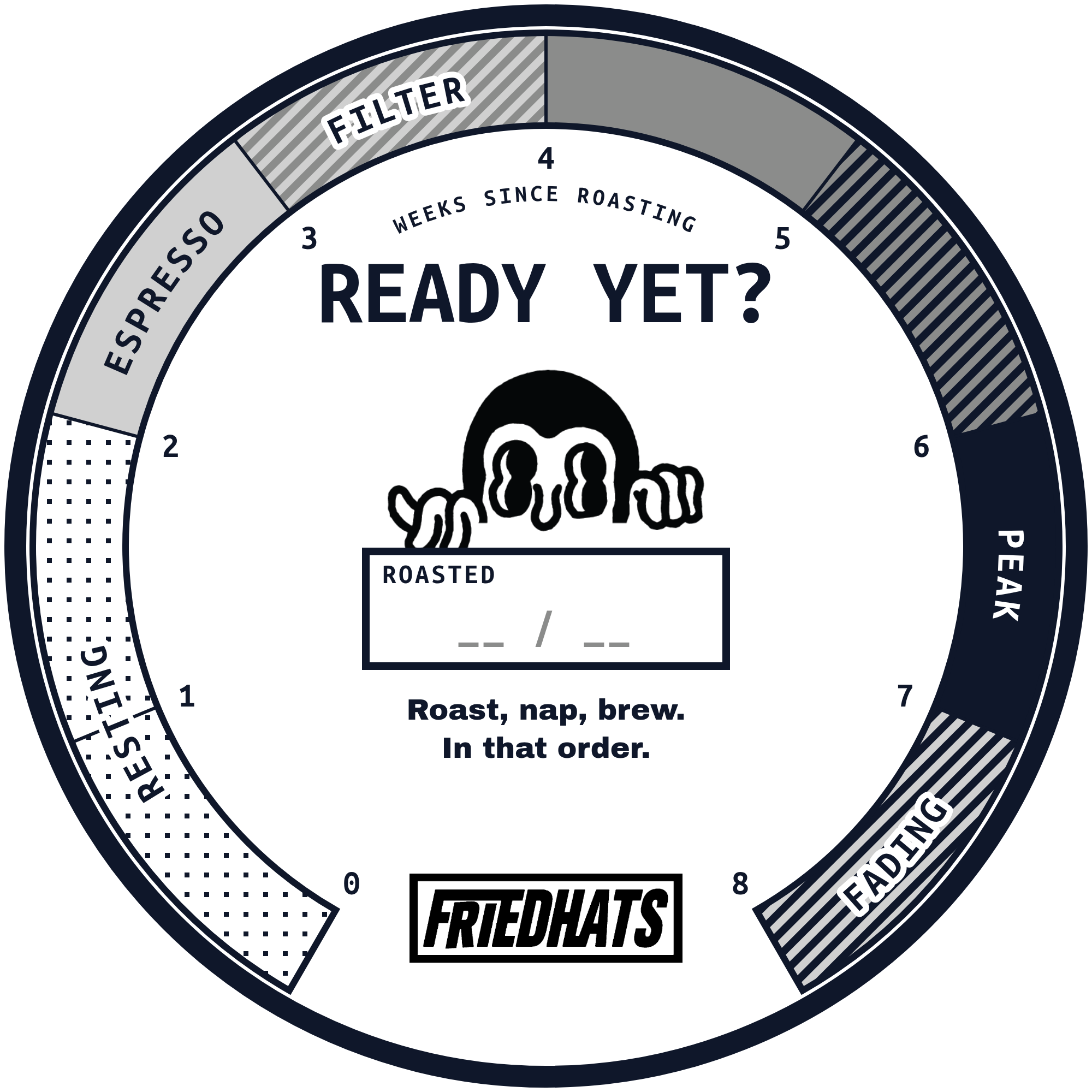
Lid sticker
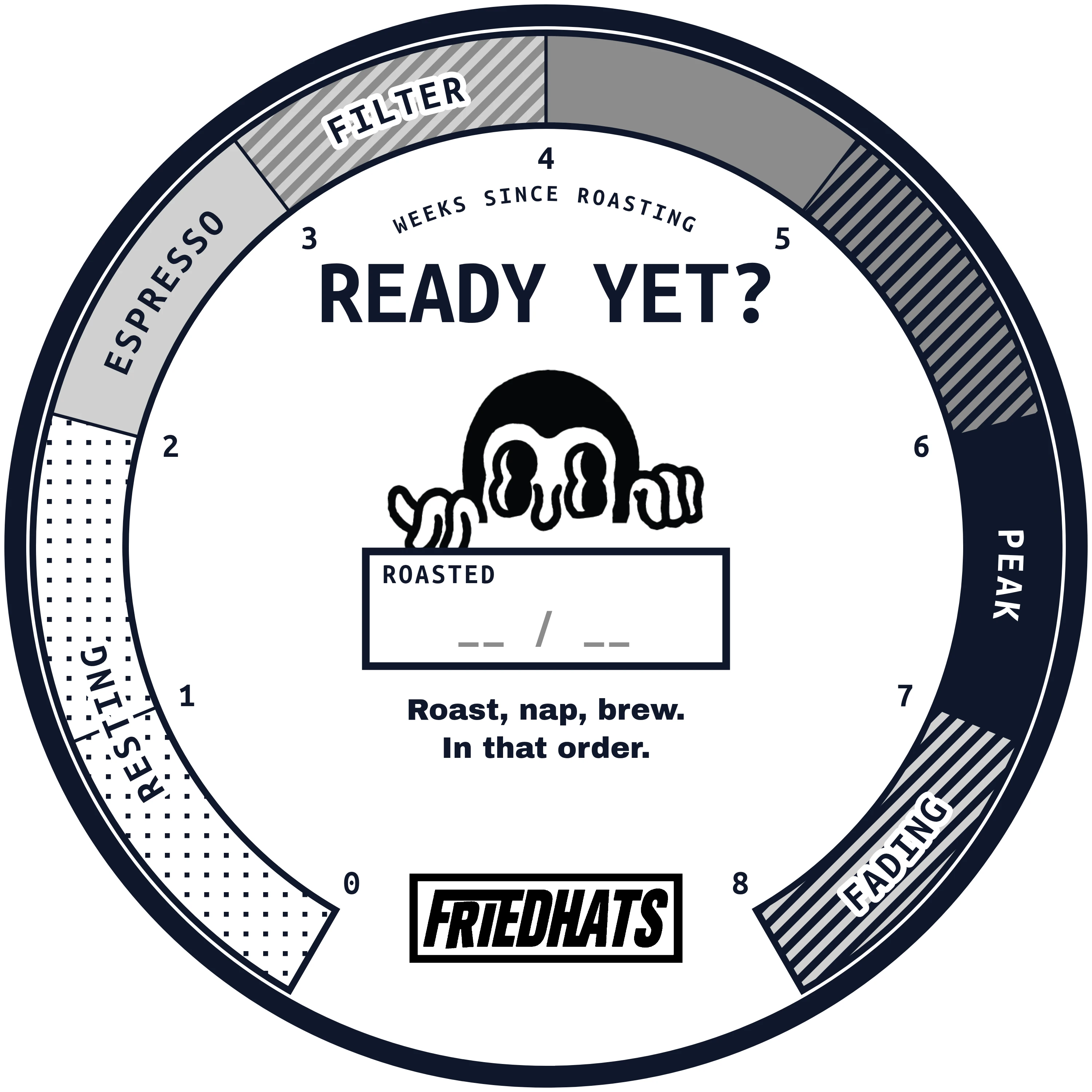
A round sticker for the jar lid that shows when the coffee is ready to brew.
What it used from the Brief
- Logo

- Type
- Ubuntu Mono BoldArchivo Black
- Colours
- #0F172A#8B8C8B#D0D0D0#FFFFFF
- Images

- Voice
- Dry: “Roast, nap, brew. In that order.”
Phone page
A phone page that tells you how long to rest your coffee, and where to return the jar.
What it used from the Brief
- Logo
- Type
- Ubuntu Mono BoldArchivo Black
- Colours
- #0F172A#8B8C8B#D0D0D0#FFFFFF
- Images
- Voice
- Conversational, with the coffee facts kept plain
Jar-return Story
A 10-second Instagram Story asking people to bring empty jars back to the FUKU café.
Music added after Review: “The Show Must Be Go” by Kevin MacLeod, from incompetech.com (opens in a new tab) under CC BY 4.0 (opens in a new tab)
What it used from the Brief
- Logo
- Type
- Ubuntu Mono BoldArchivo Black
- Colours
- #0F172A#FFFFFF
- Images
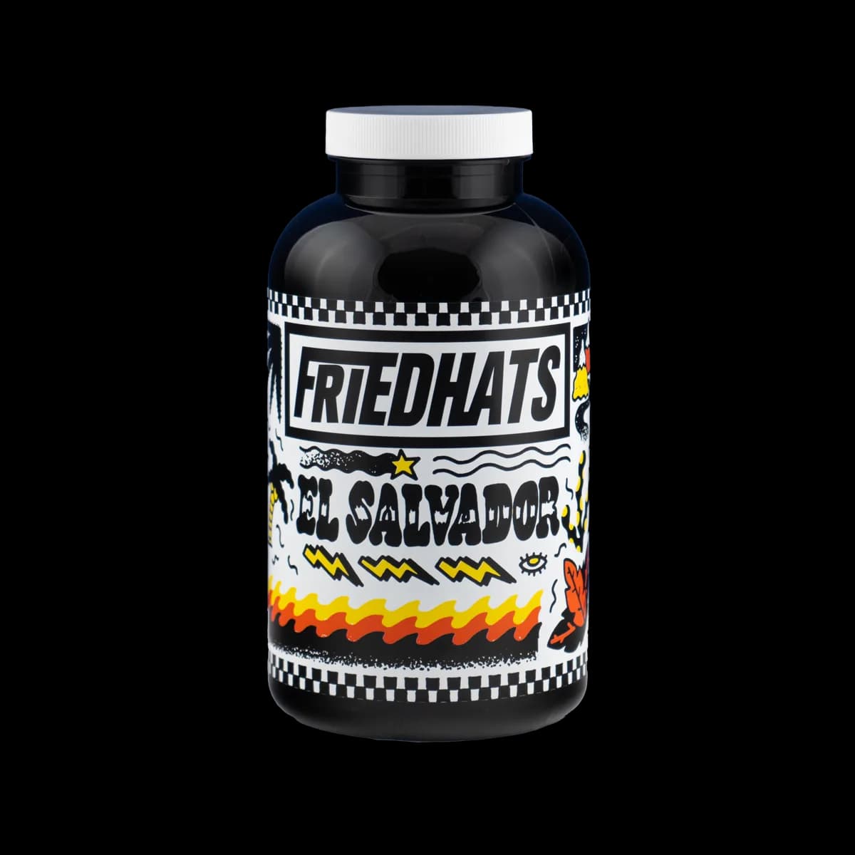
- Voice
- Playful: the jar asks not to be binned
Step 4: Get it Reviewed
Every asset was Reviewed. Review caught some problems, and Claude fixed them.
Phone page, typography check
Body copy was in the wrong font. Claude switched it to Archivo Black.
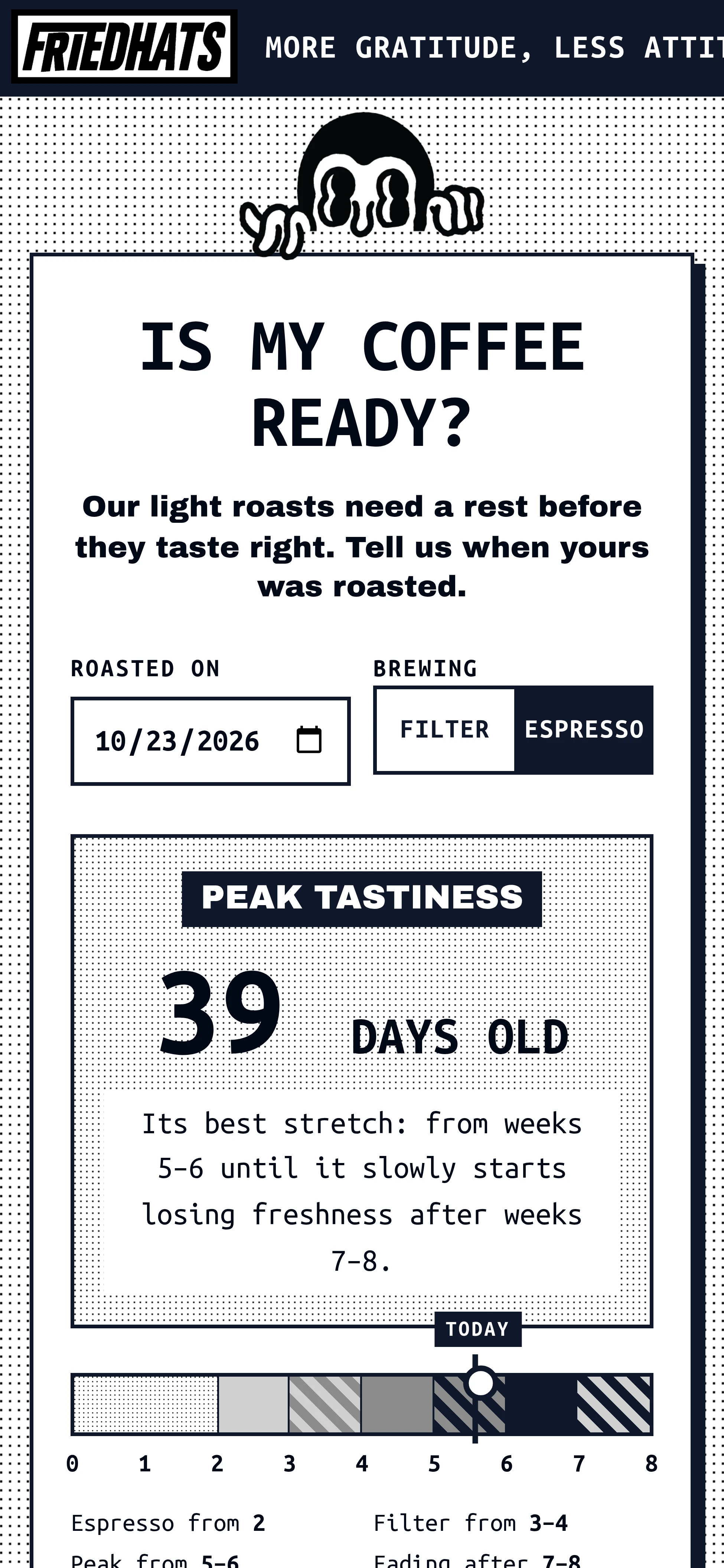
Review comment
“Headings use approved fonts, but the body text is set in Ubuntu Mono instead of Archivo Black, as the prompt requested.”
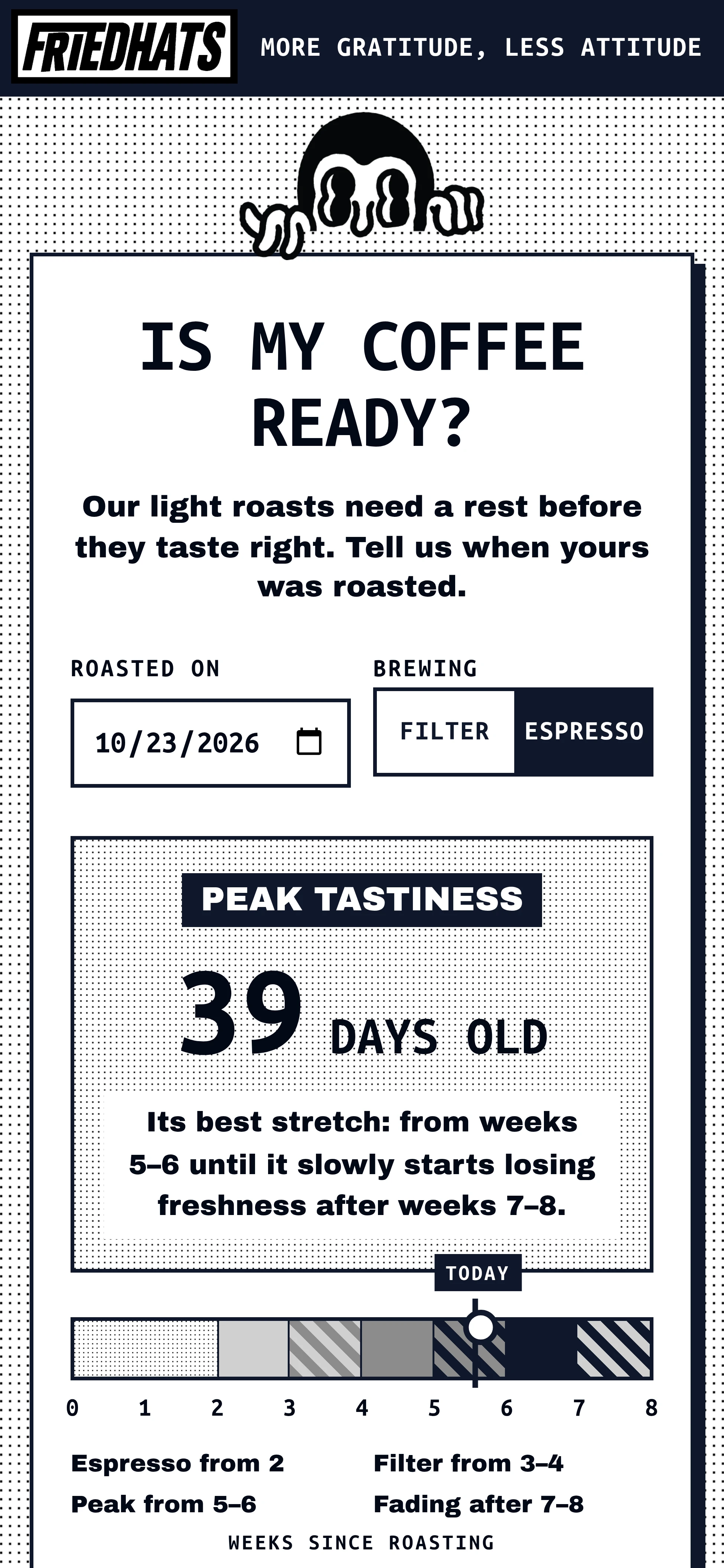
Review comment
“Headings and controls are set in bold Ubuntu Mono, while the lead line, state badge, and body copy use Archivo Black.”
Phone page, copy check
The header cut the slogan off mid-word. Claude made it one line.
Review comment
“The top motto is cut off as 'ATTIT', differing from requested copy. Otherwise, the tone fits 'More Gratitude, Less Attitude'.”
Review comment
“All copy matches the requested resting guide details, with direct, unpretentious language embodying the 'More Gratitude, Less Attitude' voice.”
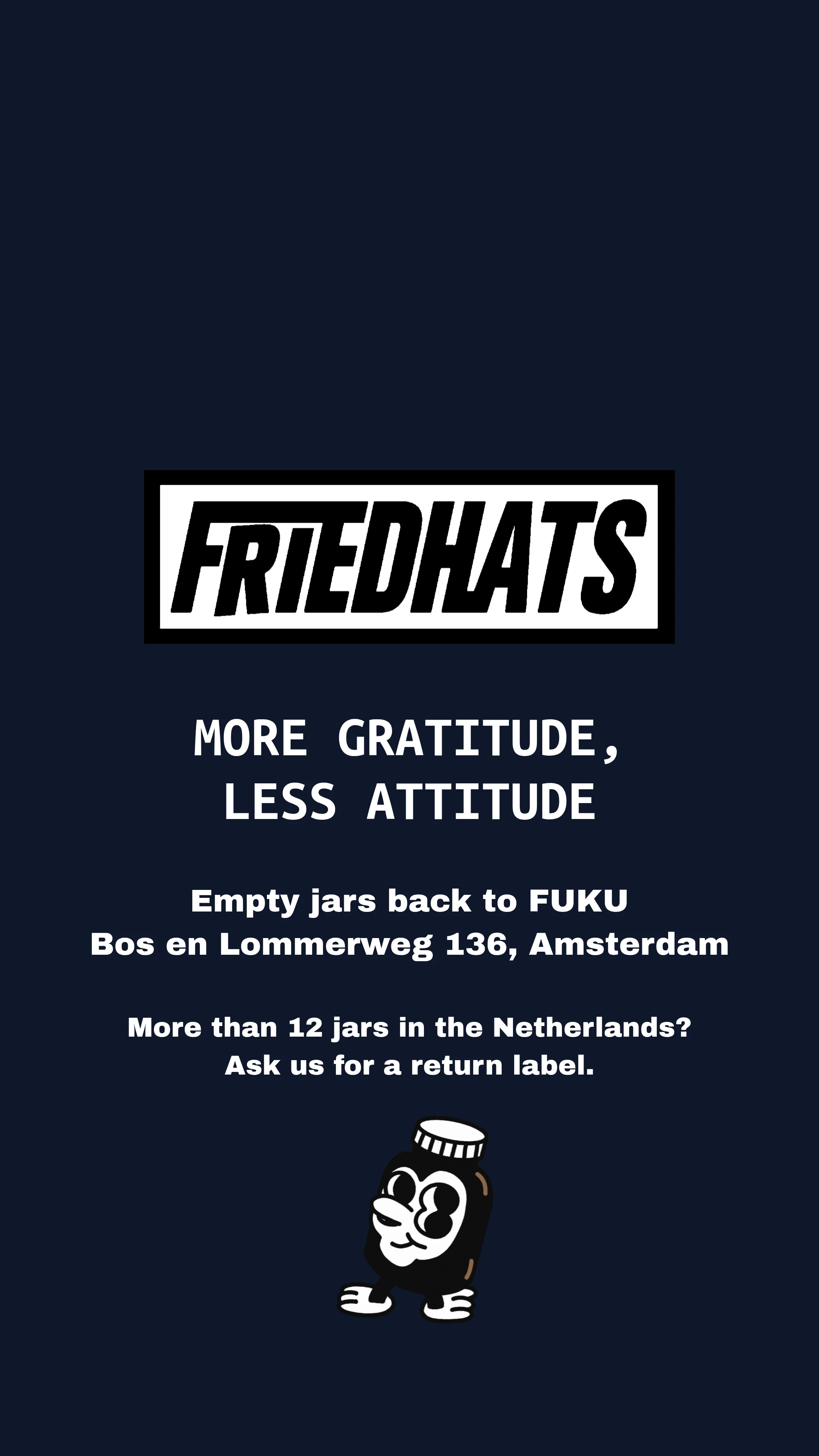
Story end card, colour check
A small note was the wrong grey. Claude made it larger and white.
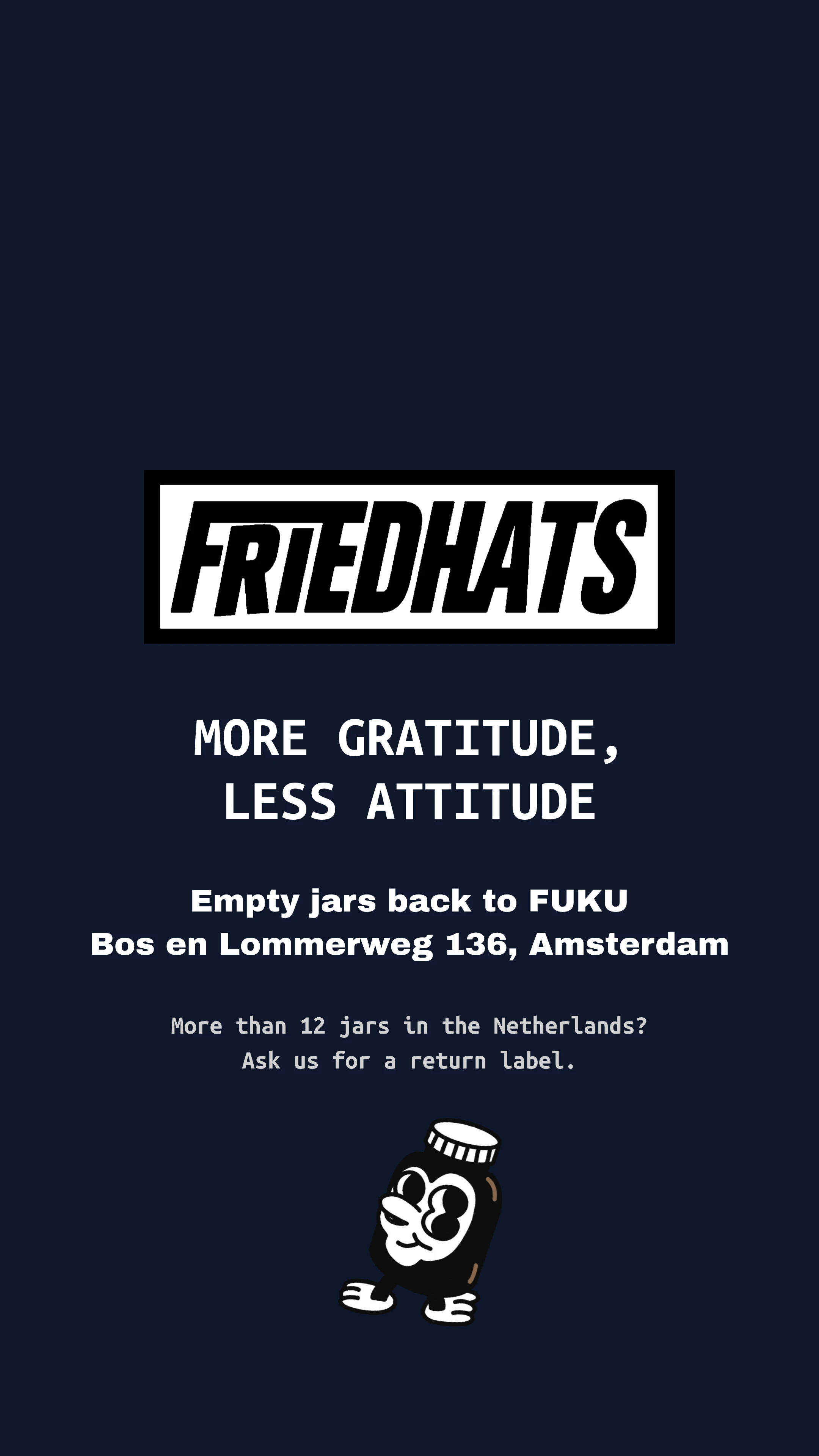
Review comment
“The background matches #0F172A, but the grey text does not match brand color #D0D0D0.”
Review comment
“The background perfectly matches core dark blue (#0F172A), and white elements match the brand palette, as requested.”
Final Reviews: lid sticker, Story end card, phone page
All three passed all 4 checks.
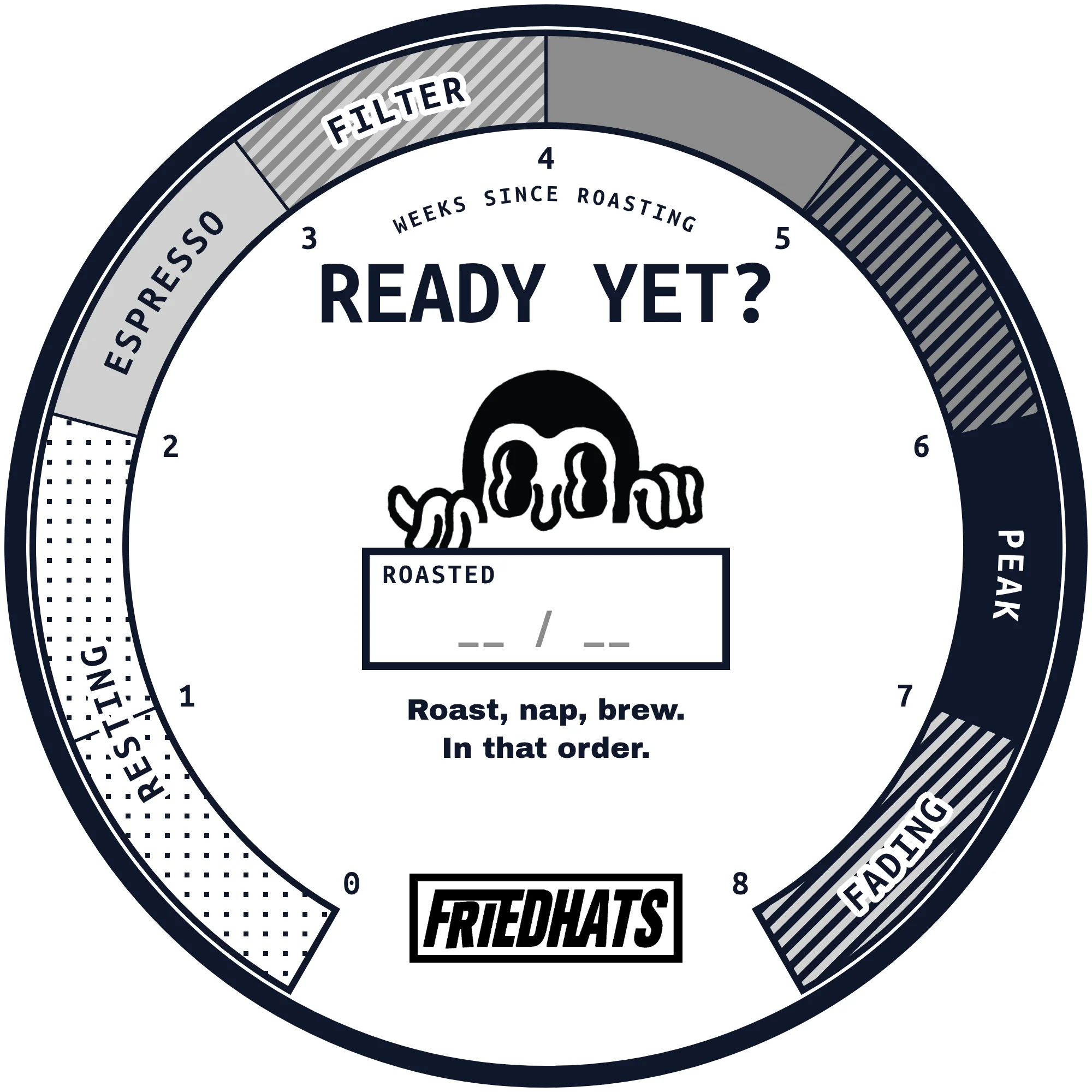
 Lid sticker PassThe round sticker for the jar’s lid.

Keep the lettering, remove the background and colour
Line up and overlap
 Open the overlap image in a new tab.
- Matching parts
- Brand only
- Observed only
Review comment
“The boxed Friedhats wordmark and Pop Looky character are unaltered, sharp, and clearly legible against the white background.”
- WordingMatches the requestMatches
- VoiceUnpretentious, cheekyMatches
Review comment
“All dial markers, resting instructions, and playful phrases match the requested text accurately and reflect Friedhats' unpretentious, cheeky voice.”
 FontUbuntu Mono BoldMatches
- FontUbuntu Mono BoldMatches
- FontArchivo BlackMatches
- Peak and outlineObserved
#0F172AApproved#0F172AMatches - Mid greyObserved
#8B8C8BApproved#8B8C8BMatches - Light greyObserved
#D0D0D0Approved#D0D0D0Matches - StickerObserved
#FFFFFFApproved#FFFFFFMatches
Review comment
“The navy, light gray, medium gray, and white elements all match the brand's core palette exactly.”
 Story end card PassThe last frame of the jar-return Story.
Keep the lettering, remove the background and colour
Line up and overlap
 Open the overlap image in a new tab.
- Matching parts
- Brand only
- Observed only
Review comment
“The boxed Friedhats logo matches the brand reference exactly, appears unaltered, and is clear against the dark background.”
- WordingMatches the requestMatches
- VoiceOn brandMatches
Review comment
“All text matches the requested copy perfectly with correct spelling, grammar, and brand voice, reflecting Friedhats' "More Gratitude, Less Attitude" ethos.”
- FontUbuntu Mono BoldMatches
- FontArchivo BlackMatches
Review comment
“The primary heading is correctly set in Ubuntu Mono Bold, and the body text is set in Archivo Black as required.”
- BackgroundObserved
#0F172AApproved#0F172AMatches - Text and logo boxObserved
#FFFFFFApproved#FFFFFFMatches
Review comment
“The background perfectly matches core dark blue (#0F172A), and white elements match the brand palette, as requested.”
 Phone page PassIs my coffee ready?, on a phone.
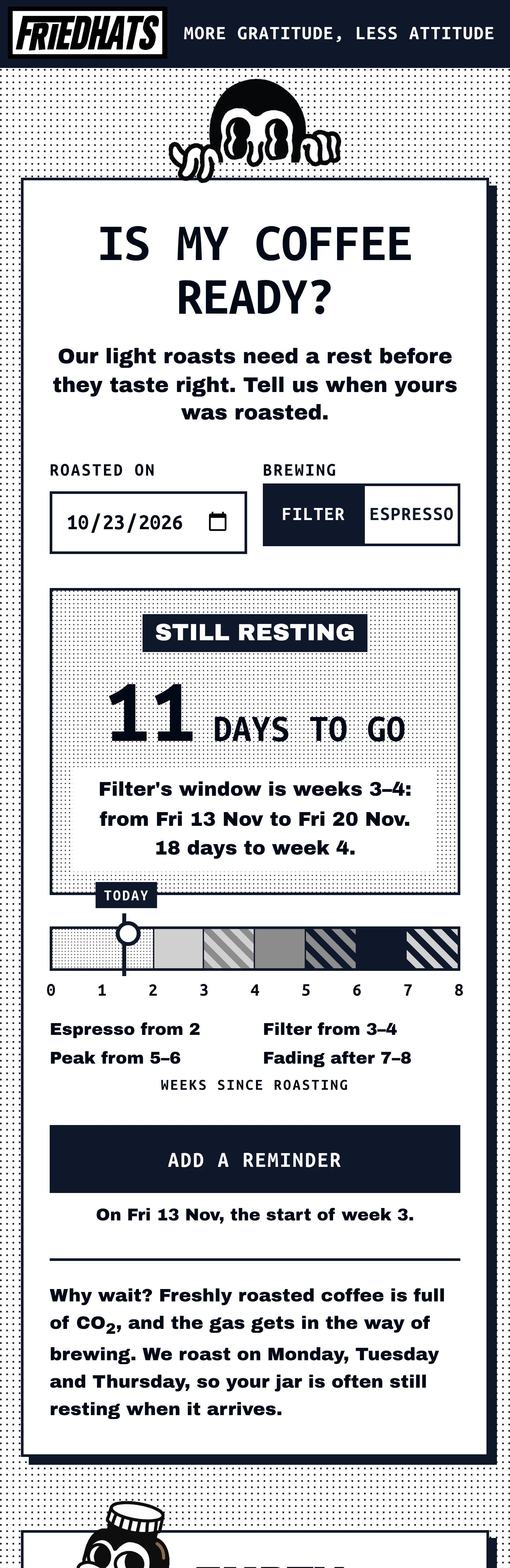
- WordingMatches the requestMatches
- VoicePlayful, informativeMatches
Review comment
“All requested resting and return copy is accurately transcribed and follows the brand's 'More Gratitude, Less Attitude' playful, informative voice.”
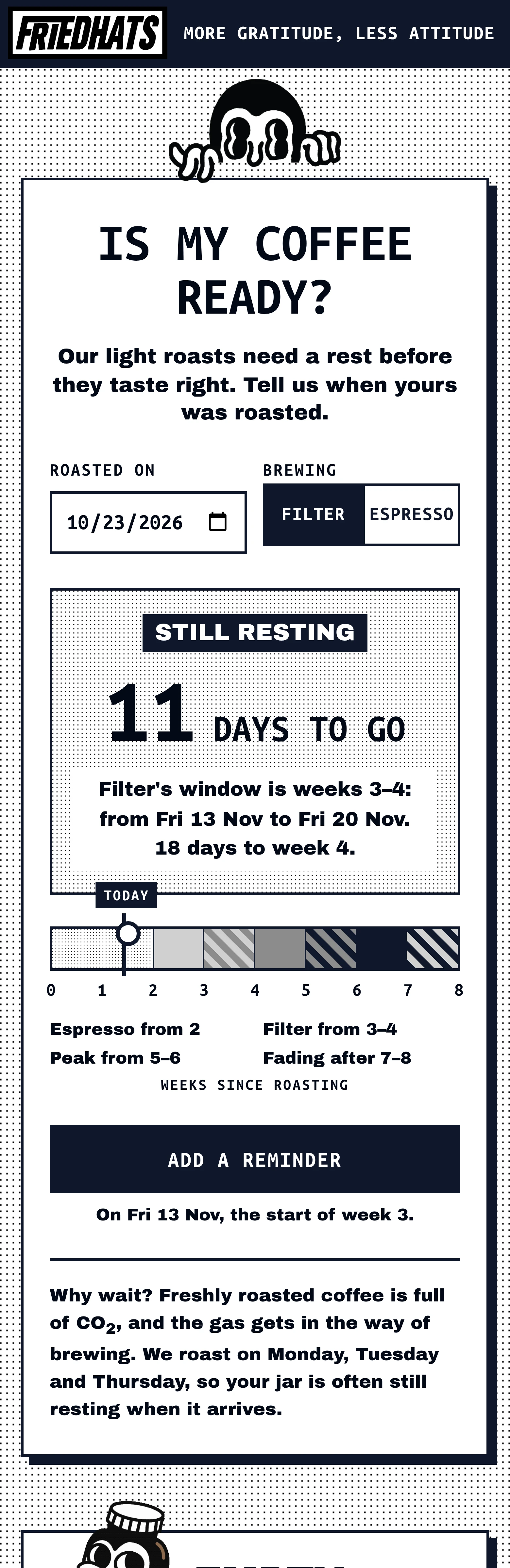 FontUbuntu Mono BoldMatches
- FontArchivo BlackMatches
Review comment
“Primary headings and buttons use Ubuntu Mono Bold, while secondary headings and copy use Archivo Black, matching the brand specifications.”
- Header, buttons, textObserved
#0F172AApproved#0F172AMatches - Scale, mid greyObserved
#8B8C8BApproved#8B8C8BMatches - Scale, light greyObserved
#D0D0D0Approved#D0D0D0Matches - CardsObserved
#FFFFFFApproved#FFFFFFMatches
Review comment
“Core palette colors (#0F172A, #8B8C8B, #D0D0D0) and website background (#FFFFFF) match brand specifications across all measured interface elements.”

Try it yourself.
Add Rainbrand to the agent you already use.

Open the Rainbrand plugin and add it.
Open Rainbrand plugin (opens in a new tab)Connect your Rainbrand account when asked. It works in ChatGPT and in Codex.

Rainbrand builds and maintains shared brand context for your agents and products.